Many Urban Sketchers use sketchbooks as a journal of their daily lives and travels. We add titles, text, and occasionally ephemera to some of our pages. It’s a natural to want the composition of those pages to enhance our sketches rather than distract from them. One way I design a page is by using the grid method.
Years of working in print production designing layouts for magazines, promo pieces, etc. has given me a lot of practice designing to the grid. It's second nature to me and a sketchy version of aligning on a grid is my go-to method for designing pages in my sketchbook. In graphic design the grid comes first. In my sketchbooks it can show up at anytime. It can be the before or after guide for a loose alignment of page elements. I want to emphasize it’s a loose alignment. The casual use of the grid is in keeping with the spirit and look of sketching.
Where, How, When?
When I’m traveling I sometimes choose a theme for a few spreads. On this trip to San Francisco one theme I was exploring was the trees. I drew the four frames freehand before I did any sketching and added the sketches over a few days. To keep the layout from being too static I left a section open for a possible surprise. Note the top and bottoms of the frames align, the bottom of the surprise pine cone and the baseline of the lower text align. The title on the left balances the lower right text.
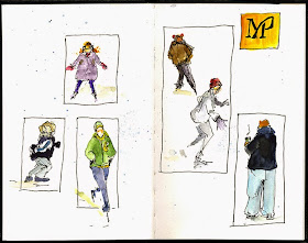
These sketches were quick observations at the ice rink in Millennium Park in Chicago. The frames were hand drawn to unify the spread after the sketches were done . The frames are lined up on either the vertical, the top, or centered on another frame. The skater on the left escapes the frame for a little surprise and aligns with the frame around the coffee drinker on the right.
When the muse strikes
If you use a ruler on the examples above you’ll find the alignments aren't labored over but are guesstimates. When I’m sketching it’s about the fun and joy of sketching and I go with the flow. I don’t always stick to the pre-drawn plan as you can see in the sketch below. Take note where the text is placed. Can you tell why I placed it where I did?
When disaster strikes
This is a series of doodles done at Starbucks in our local Target. One disappointing scribble after another provides the perfect challenge for the my grid theory.
Creating a loose alignment on the (or near) grid lines can strengthen your sketches and the composition of the page. The sketch below is a demo I did for the Urban Sketching for Beginners workshop at last summer's USk-Chicago's sketch seminar. Look at the line up of the added frames and the added text. They add organization to the page. If you want to give the post-sketching grid a try without committing use a piece to tracing paper to work out your plan.
Creating a loose alignment on the (or near) grid lines can strengthen your sketches and the composition of the page. The sketch below is a demo I did for the Urban Sketching for Beginners workshop at last summer's USk-Chicago's sketch seminar. Look at the line up of the added frames and the added text. They add organization to the page. If you want to give the post-sketching grid a try without committing use a piece to tracing paper to work out your plan.
One More Tip
I almost forgot the most important thing – no matter what the Tuesday tip or trick, be brave and have fun!


I recently started using a grid format on some of my pages but now I realize how haphazard I was. I really appreciate your refinements and the reasoning behind them. I can't wait to put them into practice... thank you!
ReplyDeleteThanks Dana, I'm glad you found this post helpful. I appreciate your stopping by. Do you post your sketches online? I'd love to see some.
DeleteSuccessful delivery Barbara, all that knowledge that you are sharing so generously came through! Thank you!
ReplyDeleteThanks Adriana! I've been enjoying your FaceBooks posts to USk-Chicago!
Delete