Pages

Showing posts with label #T&TThursday. Show all posts

Thursday, May 12, 2022

T&T Thursday

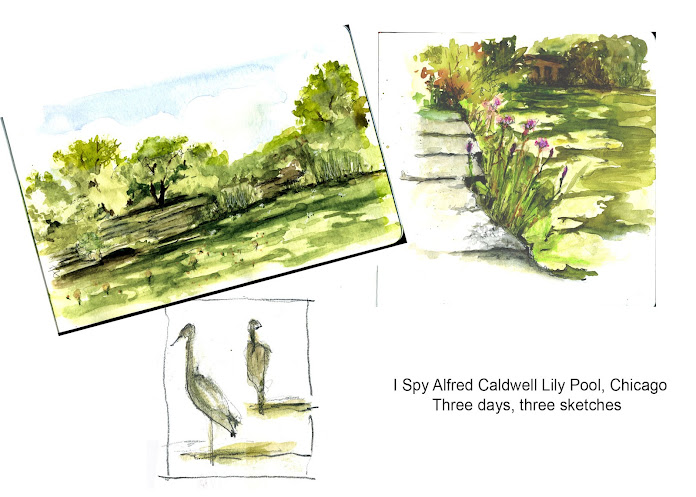
 I Spy with My Little Eye...


Something to Draw!

Have you ever sat down to sketch and thought "What should I draw?" Yes, for me at least, pretty much every time, especially if it's a place I've frequently visited.


Upping My Game

My grandsons like to play the game I Spy with My Little Eye Something..." Then the person who is "it" gives a clue(s) and the rest have to figure out what it is.

I've started to use the I Spy strategy when I go out to sketch. 

  • What do I notice?
  • What jumps out at me?
  • Why? Is it the shape, the color, do I just like it, do I NOT like it?


When I've spied it I make that the subject and plan my composition around it. The next question is "what will help others see it through my eyes?"

  • Color?
  • Texture?
  • Shape?
  • Size?


In urban sketching part of the challenge is to have enough context to make it an urban sketch without loosing my focal point. 


Game on!


Want to keep up to date by email? Fill in your email address in the place provided in the upper right corner under the banner. We look forward to hearing from you.


Thursday, November 25, 2021

T&T Thanksgiving


Tried and True Tips and Tricks 


“When you go out to paint,

try to forget

what objects you have before you,

a street,

a house,

a field, or whatever. 

Merely think,

here is a little square of blue,

here is an oblong of pink,

here is a streak of yellow,

and paint it

 just as it looks to you,

the exact color and shape,

until it gives you your own naive

impression of the scene before you.”


                                                     Claude Monet


Happy Thanksgiving!


Want to keep up to date by email? Fill in your email address in the place provided in the upper right corner under the banner. We look forward to hearing from you.


Thursday, November 11, 2021

T&T Thursday

And still growing!

What is an Urban Sketch?

By  Alex Zonis


We continue to welcome new sketchers into our group, our numbers at this writing is an impressive 1620! Every couple of years it seems useful to touch on the common topic of what is an Urban Sketch.


An Urban Sketch simply is:
  • Drawn on location, or mostly on location. 
  • The location can be urban or rural
  • it can be inside or outside.
  • It means that you are out there with your sketchbook reporting on the world as it unfolds in front of you.

There are some No’s too 

An Urban Sketch is not: 
  • a drawing from a model
  • a still life on a page without background for context
  • drawing made from a photo


Through the most difficult months of the pandemic we became more lenient in our moderating and acceptance of posted sketches. Why add more stress to people’s lives - was the justification.

Now, as we are emerging on the other side of the stressful times, Urban Sketchers Chicago is returning to our core mission - sketching on location. This also means that we are returning to moderating our USk Chicago page to the pre-pandemic level.


Here’s our favorite graphic on what is, and what isn’t, an Urban Sketch.


Want to keep up to date by email? Fill in your email address in the place provided in the upper right corner under the banner. We look forward to hearing from you.


Thursday, May 13, 2021

T&T Thursday

COLOR

By Alex Zonis


Part 1


Let’s have the good news first: color can be learned! Great colorists of the past – Turner, Delacroix, van Gogh – used the science of color. Their color is no accident or chance.


There are numerous theories and approaches to color out there. Many are helpful and can be used for practical purposes with great success. We will discuss one of them - Color Theory by Johannes Itten. Itten is regarded as a father of modern color theory. Some agree and some argue, but the bottom line is that Itten came up with a system to make using color manageable.


Going back to centuries past we want to mention Isaac Newton who discovered that visible light can be split in color bands using a prism and Count Rumford who discovered that those bands can be combined again to make something close to white light. (More on visible spectrum in Wikipedia) - 


Then it was discovered that an object appears a certain color when white light strikes it because the color of the object is reflected and the remaining light rays are absorbed.


These are fundamentals. More interesting discoveries were made, but what is important for us here is the discovery of subtractive primary colors: red, yellow and blue. This is big! Everything else flows from here. In ideal world adding any two of these primary colors produces a secondary color:


Red + Yellow = Orange

Yellow + Blue = Green

Red + Blue = Purple


Basic Theory, Color Equations and Triads


In basic color theory the primary color cannot be mixed or made from other colors. All other colors can be created from the primaries. Our color equations look like this:


Note 3 primaries, 3 secondaries, and 6 tertiary colors. They are organized into 3 basic types of triads (primary triad, secondary triad and 2 tetriary triads). These triads make a complete color wheel of 12 colors. If we take these colors and position them in a circle, we will get a simplified color wheel!


Now this begins to look like something we have seen before. How many of us have an object like this among our art supplies, probably stuffed in the back somewhere because it made irritatingly little sense?


Perhaps now it will make a little more sense! Dig it out and take a look - there is some really neat information on it!


If you are like me, you probably scrolled ahead, past the theoreticals, and are looking for good practical stuff.  This is the good practical stuff – color schemes!


Color Schemes


Leafing through your sketchbook you will likely note the similarity of colors on your various sketches. We tend to find something that works for us, satisfies our aesthetics to some degree, and we then run with it.


How can we expand our vision on colors, get out of out boundaries of habit? Regardless of the media we use - paint, markers, color pencils - we can use the logical relationships of colors on the color wheel to control and expand our palette. This is where color schemes come into play.


Color schemes are based on color similarities or differences, and usually feature a dominant color. 

  • Color schemes based on similarity are monochromatic (one color in different values) or analogues (colors that are neighbors on the color wheel). 
  • Color schemes based on difference are composed of complementary or triadic relationships, they are opposites or triangles on the wheel.

An exception is a pure color contrasted with a neutral – white, gray or black.


Here are some example sketches for each of the 8 color schemes:


Note how much variety of middle tones Don uses in this sketch. This variety creates the richness even though the drawing is monochromatic.


This is my sketch, I use an analogous color scheme from dark red-brown through orange to yellow. This set of colors creates harmony. One speck of green punctuates this harmony, but we will discuss this in the next chapter.


Complementary color schemes usually have an added benefit of simplifying the image, like here a fairly complex market scene depicted in yellows and purples appears calm and relaxed.


Many have seen this amazing yellow plane at Architectural Artifacts at our sketch crawl. What makes this sketch successful is its pure Triadic color scheme executed in primary colors. Yes, I made the brick wall more red and designs on the rug more blue to make the triad more obvious.


An interesting variety results when we can split a complement into two colors. The image become richer and more complex.


Notice how yellow, yellow-orange and orange are balanced out by blue-violet shadows and recesses give the eye a resting point.


When I teach color class, students find that this color scheme the most puzzling. That is until they realize that this is just two pairs of complements that are adjacent or next to each other on the color wheel. Like here:  yellow and violet is one pair, and yellow-orange and blue-violet is the second pair. That's all there is to it, complicated name non-withstanding.


See how the main colors of this sketch red-orange, yellow, blue-green and violet are positioned on a color wheel. They form a rectangle, this makes it a tetradic color scheme. Tetradic is a well balanced scheme, and this quality can be used to balance a composition.


Thursday, April 22, 2021

T&T Thursday


Say What?

By Barbara Weeks


As artists we each have a unique voice that we express in our work. It’s our point of view, our style. We also have another voice, the little voice in our heads that speaks to us when we draw. It may be small but it’s powerful and really influences how we draw.


Do any of these sound familiar?

  • I can’t draw people.” 
  • “That hand looks like a claw.”
  • “This building is all wrong. I never get the perspective right.”
  • “I can’t post this sketch it isn’t good enough.”


How about these?

  • “Is that line curved or straight?”
  • “What shape is that?”
  • “Which roof is higher?”
  • “This sketch expresses what I observed.”


The first set is the voice of the critic.

It speaks to us of drawing as a noun, judging what we’ve done. 

The second set is the voice of the coach. 

It speaks to us of drawing as a verb, helping us to observe our subject, get lost in the act of drawing and rendering what we see. 


The first is negative and self-defeating.


The second is positive and constructive.


You’ve heard it many times before – practice, practice, practice.

In this case you really practice what you preach. 

What do you say when you talk to yourself?


Thursday, March 25, 2021

T&T Thursday!


People Who Need (Watercolor) People

By Barbara Weeks


Often in urban sketching we focus on the architecture or landmarks we encounter to tell the story of our surroundings. There are times when we add people to the scene, even when they’re not the focus. They give scale, energy, life, and an invitation into the scene.


When you need or want an extra spark in your landscape or cityscape including people can be the trick you need. In this post I’m going to give you tips for using watercolor to add figures to your work. 


Carrots and Rectangles

  • Think simple.
  • Think shape 
  • Think gesture

The Carrot -Simple as 1, 2, 3!

There are many approaches for quickly adding figures to watercolors. I use a combination of two different methods – carrots and rectangles


Both ways employ similar mind sets.


From just a few strokes, a simple basic figure.

    1. Start with simple carrot shape 

    2. Add a head

    3. Add a little gesture and shadow 


Repeat the process and add a little embellishment. 


Now try playing with just slight changes to the gesture and size of the carrot shapes. Add more, create a crowd or a parade!


The Rectangle

    1. Start with a rectangle

   2. Add two strokes for legs

   3. Add two strokes for arms

   4. And one for a head

                                           Tah Dah! A person!


Urban Sketching


One of my favorite ways to capture the personality of a place is through its people. As simple as these methods are you can add attitude and personality.


  • Try varying the size of the initial shape – wider, thinner, longer, shorter. 
  • Paint a group of carrots and rectangles together. Let a few overlap and let the paint mingle.

  • What happens when the head stroke touches the shoulder line?When it doesn’t?
  • Experiment, add line to emphasis or embellish some of the shapes.


As always, have fun!


T&T Thursday is a twice a month column about sketching skill-building ideas. Some of the columns will be brand new, others will be refreshed columns from the past. 


Want to keep up to date by email? Fill in your email address in the place provided in the upper right corner under the banner. We look forward to hearing from you.


Thursday, February 25, 2021

Composition is a Big Word–PART ONE

By Alex Zonis


Composition can be difficult to teach

Do this, don't do that… 

Unless you want to deliberately break the rules, then do it… But it may or may not work… 

You stick to the rules - and it may end up boring. 

You break the rules - and it may end up unbalanced. 

What is a sketcher to do?


Composition is a skill, just like drawing or values or accurate color. This means that with practice a sketcher can develop a vision and understanding of the design as well as a feel for positioning of shapes within the boundaries of a drawing. By practicing composition it is possible to get and improve the sense and sensibility of what is composed well and as a result has a built-in beauty, and what needs improvement and what this improvement might be.


Composition is also a vast subject. This is another reason art students shy away from it.


Here I will suggest three things that can be practiced right away. They will work for on-location sketching without burying one's head in theory.


1. Balance positive and negative space


See that your actual objects of interest (positive space) and space around them (negative space) take more or less the same amount of space on your drawing.


Some examples:

- Crowded drawing - very little negative space


- Unfilled drawing - small subject surrounded by a lot of negative space


- Balanced drawing - subject and surrounding space take about the same amount of space


A helpful trick - an empty unfilled composition can be improved by creative cropping or borders.


2. Repetition and pattern


A human eye loves pattern. When we see and recognize repeating shapes it makes us feel clever and calms us. Repeats and patterns give an image rhythm and make it dynamic and lively.


If you are lucky to chance on a pattern when sketching on location, consider adding it to the drawing.


3. Connection


Let your subjects and objects connect, touch and overlap. This is one and an obvious way to keep the composition together, like holding hands.


Here's an example of a composition with overlapping objects.


The other way to connect is by intent, using directional lines and visual tension.

In the following sketch three solid groups of people are connected by individual figures situated between the groups. These figures create the tension that holds the composition together.


These 3 concepts are easy to remember and use when sketching on location: 

  • Positive/negative space balance
  • Patterns
  • Connections


How to use them? 


When you chose your subject or view, take another minute and make a tiny plan. Here's an example of such plan: "I will include this bridge, and the river with its interesting colors and these trees on the right bank. I will leave out these buildings on the right shore, and a willow tree on the left… they will overcrowd my drawing." 


Better yet, make a thumbnail sketch and see how it looks. Take the view you are sketching and make it into a design. Emphasize patterns if they are there. Look for geometrical patterns, color patterns, contrast patterns.

Check if your shapes connect/overlap or stand alone. If they are standing alone, is there a way create a connection or directional pull to tie the composition together? Even if there is not, you have taught yourself something about composition by having tried. 


Want to learn more about composition? See you here on March 11 for T&T Thursday!


Keep up to date by email! Fill in your email address in the place provided in the upper right corner under the banner. We look forward to hearing from you.