Pages

Showing posts with label sketching. Show all posts

Tuesday, March 31, 2015

Sketching Architectural Details

TUESDAY TIPS AND TRICKS


If you have ever finished a sketch, held it up and compared it to the actual subject only to realize that something about your sketch was just not right, this post is for you.

Between Barbara Week's recent post entitled "Off The Grid - Designing a Page" which talked about guidelines as compositional tools, and a recent architectural sketch I made, I wanted to "piggy-back" off of the topic of guidelines in urban sketching and talk specifically about how guidelines can help you simplify and map out the different parts of architectural details.

Buildings and architectural details can seem like daunting subjects to draw.  Thankfully, there are several observational cues to pick up on that will help you map out your drawing and establish an educated guess about the sizes, proportions, patterns and elements that make up your specific detail.  You don't even need to know the technical names of the architectural elements, or how they go together.  You just have to have the ability to make observations.  After all, that's half the battle of urban sketching is, isn't it?

(A couple quick side notes: 1.Check out a couple of my previous and related posts for a more full set of tips on architectural sketching.  "Perspective for the Urban Sketcher" and "Drawing Architecture: Sighting Size and Proportion" AND 2) these ideas can be applied to other subjects including figure drawing, landscapes, and most other types of subjects as well.)

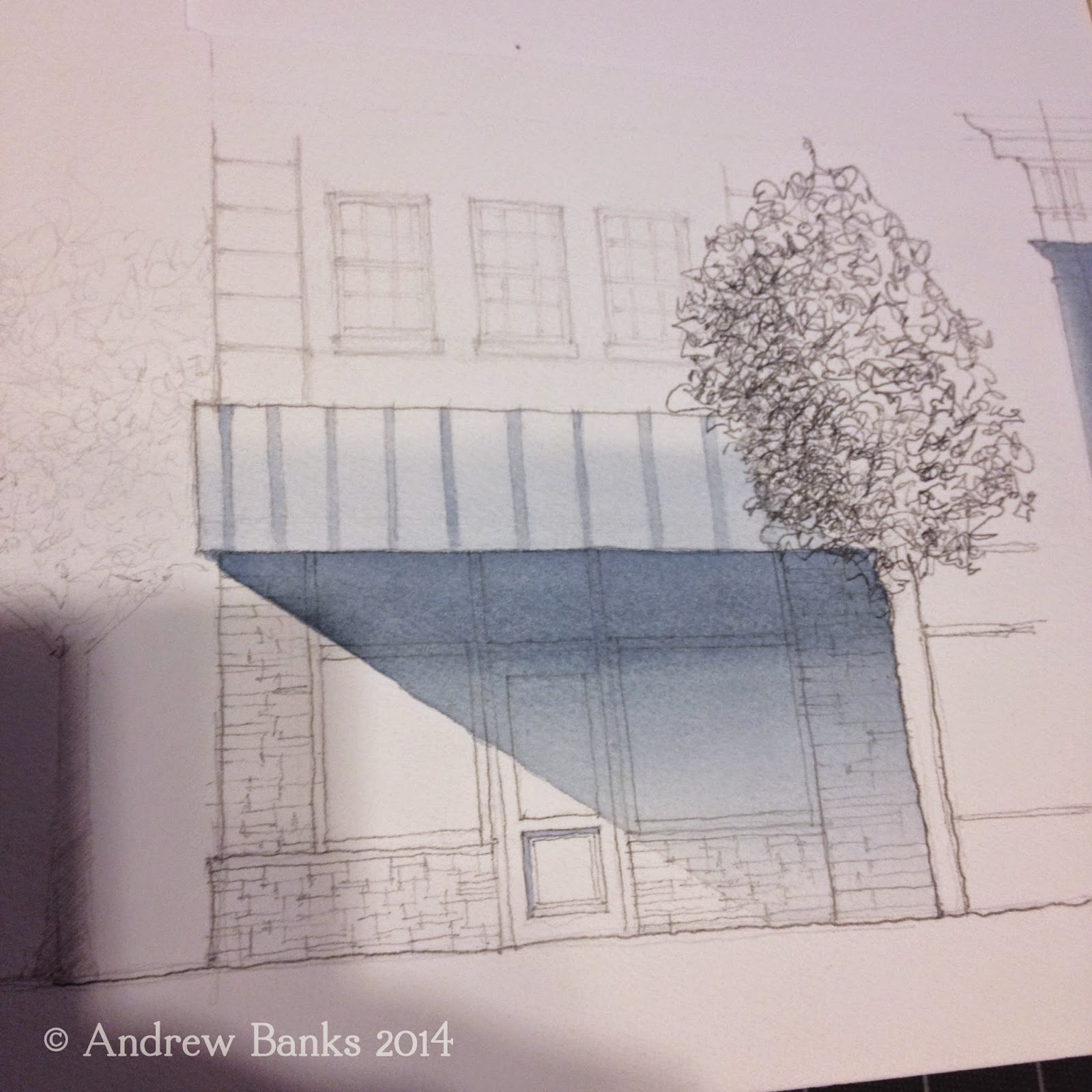
Here is the scan of my sketch.  As you can see more clearly here than in the picture above, I used several guidelines in my initial pencil sketch before adding value in ink.  I left the pencil guidelines in for aesthetics.  Personally, I like how guidelines can add to the story of a sketch.  Guidelines show your process.  They add a level of technicality to the drawing. Many of the greatest artists left pencil underlays partially visible in their masterpieces. I think guidelines give an added personal touch, but this is just my opinion.


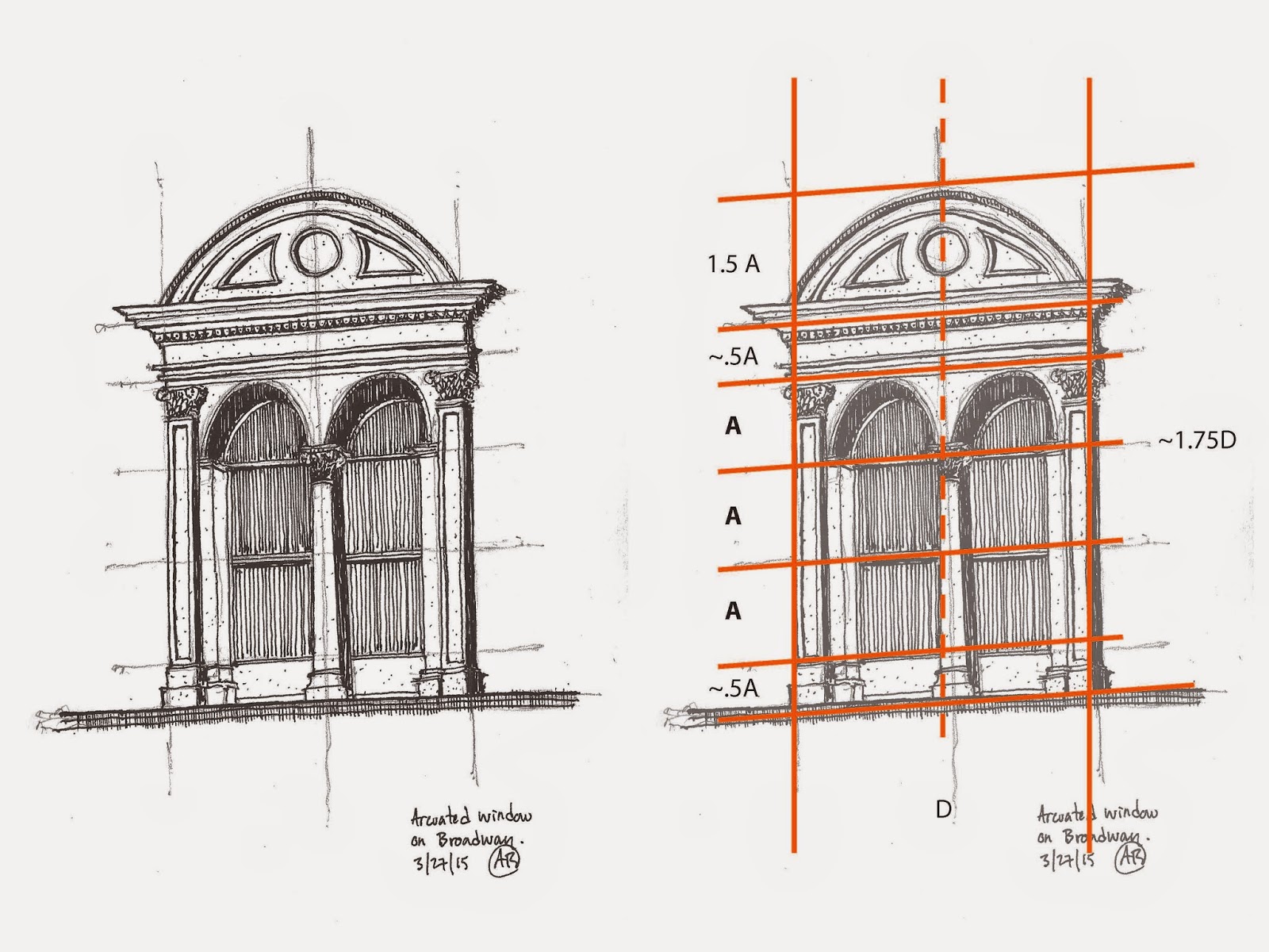
The image to the right is fairly self explanatory, however, I will share a little bit about how I approached this drawing.

I began by drawing the center line (dashed) guideline.  Since this detail is symmetrical, the center line is the most important guide to get you started.  Recognizing that the left and right sides of the detail have the same width, I added two more vertical guides, spaced equally as far away from the center line as I could have approximated while standing up, holding the sketchbook.

After I had determined the overall width of the detail, I used the sighting technique (explained in more detail here) to approximate how many widths (D) tall the detail was.  I found that the details was about 1.75 widths (D) tall.  Basing all of the approximate sizes off of one or two of the dimensions in your detail will help you keep all of the different parts of the drawing proportional to the detail as a whole and in relationship to one another.


I then drew a few horizontal lines.  I found larger shapes that I could use as benchmarks for the detail, so to speak.  So as you can see, (bottom to top) my horizontal guidelines fell on the base of the column, the center line of the window, the top of the middle column, the top of the two side columns, the bottom of the entablature, as well as the top of the arched pediment at the top.  Like in all other forms of design, there is a method to the madness in this detail's composition, which is why the sizes of A, .5A and 1.5 A all work well together, and were easy to approximate.

I drew the guidelines at the center line of the window, the top of the middle column, and the tops of the two side columns first.  A quick approximation told me that the bottom and top portions were half the height of A, and that the curved pediment on top was about 1.5A.

Now that the major heights and widths were mapped out, I filled in all of the rest of the details. (Column capitals, window mullions, arched openings above windows, additional lines on the entablature, as well as the dentils in the molding).  I did not draw guidelines for every single detail (although if you want to you can.)  Instead, since the major sizes and proportions were laid out, I could then "eyeball" the sizes and proportions of the smaller details since enough information was already mapped out for me.

This is something that may take a while to get the hang of, but once you do it a few times it will begin to make more sense.  At first, sketching like this may take a little longer than just "winging it".  However, the more you do it, the more it will make sense and will end up increasing your sketching speed in the end.  Learning how to sight size, proportion and perspectives were the most valuable urban sketching skills I learned when I was first introduced to urban sketching.  They are skills I use in almost every sketch I do to this day.

I hope this post, along with the previous posts on sighting and perspective are helpful.  Feel free to ask any questions.

Lastly, don't forget to follow us on Twitter, Instagram, and Pinterest.  If you live in the Chicago area, connect with us through Facebook.  We sketch as a group every third weekend of each month at different locations throughout Chicago.

Andrew


Tuesday, December 2, 2014

Every Visual Creative Should Keep a Sketchbook

Tuesday Tips & Tricks


Thanks to an invitation from Don Yang, Alex Zonis, Wes Douglas, and I recently spoke at the American Academy of Art in Chicago as part of their Visiting Artist Series. My section of the presentation dealt with the value and habit of keeping a sketchbook. I want to share my thoughts with you, too.

I’ve been involved with art for my livelihood since graphic design was called commercial art and cut and paste was literally cut and paste. My first job right out of college was with a small ad agency in Hackensack, New Jersey and let me tell you, I rejoice, everyday, for the miracle of the digital age. 
BUT…
Every Visual Creative Should Keep a Sketchbook!

There are as many different kinds of sketchbooks and as many reasons for keeping them, as there are sketchers but I’m only going to give you five.


Five Reasons to Keep a Sketchbook


1. Practice – the most obvious, 
Drawing is a skill and must be developed. Great athletes, musicians, actors, and artists, we all need to practice to improve and hone our performance. 

2. Record ideas
Keep your sketchbook with you always. Do it! Ideas can be fleeting. How many times have you thought, “Wow, what a great idea. That will come in handy later,” and when later came the great idea was gone? Jot it down or scribble a quick sketch!

What kind of ideas? A scribbled gesture, an eavesdropped conversation, a fleeting image or thought, a color scheme – anything!

Above the Clouds


Leonardo Da Vinci only made a few paintings but we all know him and revere him because of the ideas he recorded in his sketchbooks.

3.Experimentation 
Try out and practice with new media or tools, compositions, play with new styles– again, ANYTHING! 


Disappearing Hancock Building


4. View progress
 Overall progress – the strides you make in your artistic development over a    
  period of time, whether it’s months or years.
• Idea development – the evolution of an idea from the first scribble to finished 
  concept or product.
Family Farmed Button


5. Cheaper than a psychiatrist
This reason may be my own little reason but I share it with you. Waiting used to be a time of aggravation and annoyance for me. Now, I think, “Oh good I can sketch.” I also have more sketches done in hospital emergency rooms than I care to think about  but they kept me calm and sane. And sometimes when I’m “in the zone” it’s like meditation.


At Evanston Hospital


Five Tips for Developing the Sketchbook Habit


1. Love your sketchbook (but not too much.) I’ve had  beautiful books given to me, and some I’ve bought myself and saved them for  something special because they’re “too good” – that’s very inhibiting. It’s one more excuse not to start. Get a sketchbook you like but won’t be upset if you spill your coffee on it or the cover gets scratch etc. Get one that you will  actually use.

2. Carry it with you always (I know I’m repeating myself. It’s that important.) and use it!
I use several sketchbooks at one time, all different sizes. Some are themed – like Urban Sketchers or travel. Some are for convenience or size, a small one in the glove compartment of my car, a tiny one that fits in an evening bag, one  near the TV and the best of all my daily workhorse that is also part journal, part agenda. That’s the one that is in my bag, on my desk and beside my bed. 


3. Get over the first page fear 
If a fancy new sketchbook can be “too precious” the first page in any sketchbook can be intimidating. 
Some ideas that I’ve had success with in getting over the first page roadblock:
• Skip the first couple of pages, go back to them later if at all
• Paint the palette, brush, pencil, the tools that you’re using now
• Set up an index that you can fill in as you go along
• Write a favorite or motivating quote

4. It isn’t for sketches only  (the workhorse) 
Write in it – grocery lists, phone numbers, quotes, notes
Glue stuff in it – business cards, ephemera, travel info, maps, napkin drawings,         random scribbled ideas and thoughts etc.


Granddog- Burling

5. Share some of your sketches 
There is a remarkable community of artists all over the world who connect by sharing their work online. They make hospitable and willing companions to sketch with wherever you may find yourself. They’re only FaceBook post away. Sharing your sketches whether it’s Twitter, FB, Pinterest, or wherever, is also a great motivator and you’ll find inspiration in the work of others. 

The sketchbook habit develops our drawing skills and cultivates that spontaneous work on location that is urban sketching. By keeping a sketchbook and acquiring the sketching habit, urban sketching isn’t something we do but it becomes part of who we are – Urban Sketchers.

Tuesday, October 28, 2014

Graded Wash in Watercolor

Tuesday Tips and Tricks

Watercolor is a great tool for urban sketching.  In this post, I will show you a technique I use frequently in both urban sketching and my professional work.

Watercolor is a delicate media and can be frustrating to work with if you do not have some basic steps to work with.  Graded washes are a helpful skill to know when wanting to capture light, shade and shadow.  In nature, light rarely hits a surface as a flat tone.  Factors such as the orientation of the subject, the context of the subject and the direction from which the light is coming from all impact how light appears on the subject. 

Here is a step by step process for creating a smooth, graded wash with watercolor, followed by a few practical applications for graded washes:

Creating the Graded Wash:


1)
Hold your sketchbook or paper at an angle to allow the watercolor to flow down the paper.  About a 35 degree angle works well for me.  If the angle is too high, the water will drip too fast for you to control.  If the angle is too low, the paint will not move fast enough, could cause unwanted buckling of the paper and will not allow for a smooth wash.

2) Load brush with completely clear water.  Apply clear wash to paper, creating a bead, allowing the water to gather slightly.  (If your angle is just right, the water will stay where you guide it.)  Make sure there is an even amount of water in all parts of the bead.


3)
  Load your brush with a highly diluted watercolor wash and introduce it into the clear wash before it has time to soak into the paper and dry.  With downward brush strokes, pull the bead of paint down the page.  You will begin to see the pigment from your brush get pulled into the clear wash.


4)
Load your brush with a slightly more pigmented wash and introduce it into your bead, continuing to pull it down the page.  (Work on doing this quickly.  If you allow the bead to dry, you will be left with a line of color that will interrupt the graded wash).


5)
Load your brush with the highest pigmented wash and continue to pull the bead downward.


6) Bring your bead to your desired edge or location.  Shake the brush off of or touch the brush to a paper towel to absorb the excess water.  Gently touch your dry brush to the bead.  Your brush will absorb the excess water back into the brush, leaving an even surface of paint on the paper.  If we left the bead of water on the paper, the excess paint would diffuse back up into the earlier wash and would create an unwanted stain.


7) Repeat steps 2-6 until you get the values you want.

Graded Wash Applications:
Here are just a few examples of applications for graded washes

Shadows
Here, the graded wash works perfectly for a shadow cast on the underside of an awning.  On a sunny day, light will reflect off of the ground surface back on the building wall.  The graded wash allows you to show this reflected light gradually darkening as it gets farther from the ground and up under the awning.


Curved objects
Curved objects have a range of tones (highlight, mid tone, shadow, reflected light, cast shadow) that can be achieved with graded wash.

Skies
Depending on where the sun is in the sky, the sky will have a graded wash.  For example when the sun is low on the horizon, the graded wash will be light on the horizon line and darker the higher you go into the sky.  When the sun is higher in the sky it is generally the opposite.

Tuesday, September 16, 2014

Tuesday Tips & Tricks: Thoughts on Talent

Many times, as I am sitting sketching in a park or a cafe, someone would stop by, look over my shoulder, and then say with a wistful air "I wish I had your talent… I'd like to draw too…"

I usually hesitate to tell them, but I will tell you: I have no talent.

What I have is an incessant desire to make images. I have persistence and tenacity. I gave up on instant gratification and the need to look good right away. I bought in on an idea of 10,000 hours. But talent… no, definitely not. But let's examine the situation with more attention.

For decades I did not draw or paint or make art, because I was convinced that I had no "talent". Fairly late in life I came up with a rebellious idea that I don't actually need this thing "talent" to draw or paint. Ha! What a liberation it was! I took a pencil and did an exercise from a drawing book, the year was 2009:


I did more exercises from books, and interestingly enough my drawings got better.


Then I came across a book by Malcolm Gladwell "Outliers: The Story of Success" and read about 10,000 hours concept. The idea is that you need about 10,000 hours of practice to get good at whatever you want to get good at. I did the math: working 8 hours a day, 5 days a week, gives 2,000 hours of practice in one year. In 2010 I've barely scratched the surface… I realized that I needed 5 years of dedicated practice. I also realized that I don't need "talent", I need skill. That was doable, and I got to work.

2010


2011


2012


2013


2014

These are some examples. I did a lot more stuff than that. I painted and studied, and later on taught as well. 

Today, in 2014, I have done my 5 years - 10,000 hours. I have moved from being afraid of putting a pencil to paper to being a professional artist and a painting instructor. 

Here's one more thing to keep in mind. In the beginning of your 10,000 hours quantity is more important than quality. There once was an experiment in a pottery class of an art school. For one semester a class was divided in 2 halves. Students in the first group were asked to make one single pot each during the time of that semester, but it should be the best pot they ever made. The grade would be given based on the quality of that single pot. The second group was asked to make as many pots as they possibly can, quality and beauty not important. These students would get their grades based on the number of pots they made, the more the better. As you probably guessed, by the end of the semester pots produced by the "quantity" group  were better and more beautiful than single pots made by the "quality" group. 

This example comes from a book "Art & Fear: Observations On the Perils (and Rewards) of Artmaking" by David Bayles and Ted Orland. You can get this book from Amazon for under $4.00 used. It is a little book - 120 pages, small format - with a lot of wisdom. This will be the best art book you ever bought.

A practical and observable shift in quality of work occurs through practice and work. "Talent" is not even a part of this equation.

During my years of practice and self-study I arrived to several conclusions that I want to share with you:
  1. If you can write a grocery list - you can draw too. You have all visual and motor skills that you need.
  2. There is no such thing as talent. Talent is a man-made construct that is not really helpful.
  3. Drawing can be taught. Why do you think there are so many art schools and art teachers. Find the right one. Teaching yourself works too.
  4. Practice and time on task is all there is. Don't just trust me, try for yourself. Then come back in 6 months and thank me :).

Tuesday, August 5, 2014

Tuesday Tips & Tricks: "Framing a Sketch"

Framing a Sketch
   
Have you ever made a sketch that you felt was missing something or was unfinished?  Couldn't figure out exactly what it needed?   A well thought through sketch can mean many different things depending on who you are talking to, but for me, one of the most important factors of a beautiful, well composed sketch is how it is framed.  I’m not talking about ripping your sketch out of your sketchbook, taking it to Michael's, having it matted, thrown in a frame and calling it done (although many of your sketches deserve to be framed), because that would be too easy and this post would be a waste of your time.

So what do I mean by framing a sketch?  Here are a few bullet points on what framing a sketch is, followed by just a few of my favorite examples and techniques:

Framing a sketch:   
  1. is to compose or arrange the subject of your sketch in a way that draws attention to the most important part of your sketch
  2. is the ability to draw your viewers eyes to what you want them to see
  3. is putting your sketch in a position to be resolved, and finished compositionally
  4. can be done not only for long, involved sketches, but ALSO for quick, on the go sketches
Examples:
Here a few of my favorite framing techniques:

Isolation:
Pick one object out of a particular scene and draw it so that it can stand alone and still look complete. Instead of capturing everything you see, just pick one object.  Here I drew the Villa Rotunda, and centered it on the page.  In order to suggest what it’s surrounding looks like, to resolve the sketch, and to give the building something to visually rest on, I drew a wavy line that very quickly begins to suggest where it is.  The line centers the building within everything that is drawn, and makes the building the focal point.
© Andrew Banks 2014

Incorporate the Subject:
This might be one of the most popular techniques.  Use your subject to your advantage.  Transform the subject into the framing device for your sketch.  Here I used two obvious options, a window and a door. Everything fits inside the openings and the frame becomes part of the sketch. 

© Andrew Banks 2014


© Andrew Banks 2014
Fading:
Fade out the edges of the sketch by using less pigmented paint, less cross hatching, less shading etc...  The detail will be concentrated in the center while the faded out edges focuses the attention where you want it to be .

© Andrew Banks 2014


Architecture:
Use architecture and architectural features such as walls, arches, colonnades, columns and even windows to frame your sketch.

The buildings on the left and right rise up on each side of the picture plane, framing the busy street scene.  © Allan B. Jacobs 2014


This column and arch is the focus of the sketch as well as a framing device for the background content of the sketch.
© Andrew Banks 2014

Landscape:
Compose the subject in a way that allows natural or built landscape features to frame the subject. Some popular and effective landscape features are trees, tree trunks, tree canopies, bushes, large plants and flowers, leaves, and street furniture (planters, benches etc...)

The tree canopy curves over the top of the entire sketch.  Combined with it's strong, dark value, it works as a strong framing device. © Allan B. Jacobs 2014
Value/ Contrast / Line weights:
Differences in value, contrasts, and line weights are perfect framing tools.  Use objects with more value or thicker/stronger line weights along the perimeters and in foregrounds of your sketches.  Lighter values and line weights will recede to the background, allowing your framing devices to be that much more evident.


Buildings in foreground, on left and right have stronger line weights than those in the background.
© Andrew Banks 2014


The contrast in value and drawing technique of the trees from the rest of the drawing emphasize them as framing devises. © Andrew Banks 2014
Literal Frame:
This is the least creative of the options, yet an option nonetheless.  Draw a literal box around your sketch. Make sure your drawing fills up the box and that parts of the sketch come into contact with the box.
© Andrew Banks 2014

A fun twist on the literal box is to break the box up and allow the subject to overflow out of it.  Here, the dropped out silhouettes of the people on the bottom become part of the continuous line border of the sketch.

© Andrew Banks 2014


I hope you find these tips to be helpful!  Feel free to comment with any questions or any of your own framing techniques!

-Andrew


Wednesday, September 4, 2013

Urban Sketching on an iPad

I love my little dog. I really do. So when you see me do something that looks like torture to the poor thing, please don't hate me.

It's for his protection. I mean he squints in the sun and he swims in (ugh) lake water. So we got him these wonderful mini swim goggles, just like the kind Michael Phelps wears, right?

Only Miles did not see the connection. In fact, I'm not really sure what he actually could see through those tinted orange lenses.


If Superman's color of peril is "green" (Kryptonite), then surely my dog Miles' color of peril has got to be "orange" because once we strapped these on his head, he froze in place like we had just administered some kind of corporal punishment.

So, long story short, we took the goggles off of him--right after I captured this image on my iPad. No, I didn't make him wait that long. I snapped a photo of him, threw off the goggles, or "doggles," and gave him hugs and kisses.

Sketched on my iPad using the "Paper" app by fifty-three. Awesome app, by the way, in case you are thinking of adding the iPad to your Urban Sketch Kit. If you'd like to learn more about what I have learned on the iPad for sketching, send me a reply and ask away.

Tuesday, August 20, 2013

Chinatown Revisited


Sunday, I went sketching with the Urban Sketchers Chicago group.  It was really wonderful to meet some sketchers I had not met before.  We revisited Chinatown, where we had sketched last year.  We are thinking this should be a yearly event.
I arrived early (really?), so while I waited for the others to appear, I did a few sketches, sitting on Cermak Road, facing north.  The first sketch is a portion of the Three Happiness Restaurant, and the view up Wentworth Avenue.
(Pencil, Micron pen, watercolor in Holbein post card book)

Next, I sketched people who were passing by or standing around.  I loved the young woman who was listening to a tour group leader giving a lecture.  The young woman kept fidgeting her legs around, while keeping her arms crossed.  Even from across the street, it was obvious that she was bored out of her mind!
(Pencil, Micron pen, watercolor)

The next two sketches were done at Chinatown Square, a block or two north of Cermak Road, on the west side of Wentworth Avenue.  We were happy to discover that there was a Chinatown Festival happening – and it was very festive!  We were entertained with music, young children dancing, many different people and even a procession of monks.  I set up my little, bum-numbing stool, and began to draw.
When I finished the drawing of the horse sculpture, I acquired a small fan club – two young girls, around 10 and 11 years old, and their twin cousins, the most adorable four-year-old boys.  The older girl asked me to draw Angry Birds.  (I had to use my phone to find an Angry Bird to draw – the red one, of course!)  Then the boys had to have Angry Birds as well.  One of the boys asked me to draw a big house.  (The house I drew could only have been inhabited with stick figures!)  While I was drawing and looking down at the paper, one of the boys kept putting his face under mine, bringing our foreheads together, and staring into my eyes.  I’m not sure what that was about!  Then the younger girl asked me to draw flowers.  I drew everything and gave them the pictures.  They hung around for about an hour – a very appreciative audience – and I enjoyed it immensely!

(Both pages done with pencil, Staedtler pens, Micron pen, and watercolor 
in an Arches Travel Book, 140 lb. paper)

I copied the symbol for “horse” from the base of the sculpture.  Then, the oldest member of my fan club asked if she could draw the “new” symbol on my page.  I was delighted with that!  All in all, a great day with the Urban Sketchers!


Tuesday, April 2, 2013

Opening Day!

I was determined to attend the White Sox opening day game this year, and I did!  My husband, my sister and I braved the 37 degree temperature, warmly bundled, and we were rewarded with a Sox win - over Kansas City!!  Even better!  Looking forward to many more games this year.

On the Red Line, I sketched a little with ballpoint pen in a sketchbook I made with grey pastel paper.  I increased the contrast at home with a Micron pen.

At the ballpark, I sketched in my S&B Beta book with pencil, since my ballpoint decided it was a little too cold to release its ink.  Added the color and darker lines at home with Micron pen, water soluble Staedtler pens, and watercolor.

Passing Wrigley Field on the Way to Sox game

My husband, Rick

Opening day montage


Monday, February 18, 2013

Sketches from the Conservatory


I really enjoyed the day. I love sketching with markers! I used Copic markers on Render marker paper.