Pages

Showing posts with label watercolor. Show all posts

Tuesday, June 23, 2015

Mixing Peachy Flesh Tones

Portrait by Charles Reid
Last year shortly before the first Sketch Seminar, I first came across the beautiful watercolor portraits by Charles Reid. If you haven't seen his portraits before do yourself a favor and go remedy that at once!
Photos provided by "Watercolour Fanatic"


Until that point I'd been using a water soluble crayon in something like a peach tone for my sketches. There is is just something about the way Reid's colors melt into one another that made me feel like I had to try his method.

After a little digging in search engine results I came upon a video clip where he shares his color recipe. You can watch it here.
washes of this recipe in various intensities

Reid's basic recipe:
2 parts cadimum red
1 part cadimum yellow
dot cerulean blue (worked out)

Now I haven't been working with watercolors very long so there are some colors that just baffle me! Yes, that is to say that I don't own cerulean blue. Instead I subbed my cheap phthalo blue. I think it worked well – when I remembered to work out the pigment before adding it to the mix!

Photo taken from Gurney's Blog Post
I really enjoy using this mix of colors in combination with this guide for color points I found on James Gurney's blog. (Another artist worth investigating!) Of course there is a way to use this guide that looks suspiciously like a clown, but with moderation and enough water things tend to level out. Below is a study I did with Reid's color mix and Gurney's hints.


Even though I still over work my paint relatively often I greatly prefer this method for peachy tones to my crayon. Why? Well, with a dash of yellow ochre or raw sienna can really shake up the tone. Mixing these tones instead of using a pre-made color brick is also great because it gives a gradient between colors that really shows off the benefits of watercolors.

What about you, do you prefer premixed colors or mixing your own? Why? Do you have a favorite peachy recipe? How about other skin tones?

Tuesday, May 26, 2015

Pocket Palettes

My first pocket palette from an Altoids tin
My love of pocket palettes began in the early summer of 2012. I was preparing to visit France and was enamored with the idea of painting Paris. But being very new to watercolors I wasn't sure how to travel with them. A friend mentioned using an Altoids box for a palette, and as I started looking for options I fell into the world of pocket palettes!


These wells are bigger than full pans!
That summer I made my first palette and it went to France with me stocked with very cheap student watercolors. I sat in parks sketching statues with it and there painted the first watercolor painting I was proud of. Now I know how huge the wells were, but overall I loved the thing. While I've since seen great tutorials ranging from using empty half-pans with magnets to soldering wells into the tins* this construction was easy to construct in an urban apartment and I didn't have to order any supplies.


*This tutorial has since been removed.


Mixing area as extra "lid"
The wells and mixing space were shaped with SculpeyTM polymer clay inside the tin and baked there according to directions. After cooling, I painted the wells and mixing area white with acrylic paint to help seal the clay and to make the colors more visible. With use, the mixing area detached from the lid. Instead of gluing it back, I found that it fit well as an extra "lid" over the paints. After three years of use the tin is beginning to rust in a few places, but given all I've put it through a little rust doesn't seem like much.


After finding USk Chicago, I upgraded to a 24 color Field Kit of Koi watercolors made by our sponsors Sakura. It is a great kit with little details that really take it up a notch! (If you've been wanting to try one, be sure to join me for Supply Speed Dating at the seminar in July.) But I'm always looking for ways to change up my sketch kit.

Makeup case pocket palette (with two additions)

Last summer just before the seminar, I learned a new mix for skin tones and wondered how my sketches might change if I mixed all my colors. I planned to rework my Altoids palette but was too busy painting to think about a layout. That's when I noticed the eyeshadow box I was about to throw away. After cleaning out the remaining makeup, I had eight empty slots about the size of a half-pan! I painted the inside of the lid with clear gesso to make it a better mixing surface and put in my colors. At less than half the thickness of my tin it is truly pocket sized!

I love the Quinacridone Gold in the top left, but needed the tamer Yellow Ochre too

I used this palette for all my sketches at last summer's seminar, but latter added in two other slots for variations in my primaries. When I just go out with my smallest watercolor kit, I choose this little palette and a water brush. It even fits in the tiny pockets of women's dress pants!

But as always, I'm still looking for a better pocket palette to carry with me. Right now I'm considering making a trip to the Chicago Public Library to make a 3d print of this insert for a pocket palette.

Have you tried making a pocket palette or even several? What makes a watercolor palette ideal for your urban sketching? What's the smallest palette you've ever worked with or seen?


Tuesday, May 19, 2015

People Who Need (Watercolor) People

Tuesday Tips and Tricks:


Often in urban sketching we focus on the architecture or landmarks we encounter to tell the story of our surroundings. There are times though, when we add people to the scene, even when they’re not the focus. They add an element that can make it easier for the viewer to connect with our visual story. People give scale, energy, life, and an invitation into the scene. When you need or want an extra spark in your landscape or cityscape including people can be the trick you need. In this post I give you tips for using watercolor to add figures to your work.  


Carrots and Rectangles

There are many approaches for quickly adding figures to watercolors. I use a combination of two different methods – carrots and rectangles. Both ways employ similar mind sets.

  • Think simple.
  • Think shape 
  • Think gesture

The Carrot:


     1. Start with simple carrot shape            2. Add a head                     3. Add a little gesture  
                                                                                                                    and shadow
The result from just four strokes, a simple basic figure!


Repeat the process and add a little embellishment. 


Now try playing with just slight changes to the gesture and size of the carrot shapes. Add more, create a crowd or a parade!


The Rectangle:


1. Paint a rectangle    2. Add two strokes for legs    3. Two strokes for arms   4. One for a   
                                                                                                                              head
Tah Dah! A person!

Urban Sketching


 Saturday Morning at the Green City Market, Chicago


Using these simple methods as a starting point you can add the attitude, personality, the
 character of a place, through it's people.

Character Builders:

  • Paint a group of carrots and rectangles together.
  • Let a few overlap and let the paint mingle.
  • What happens when the head stroke touches the shoulder line? When it doesn’t?
  • Experiment, add line to emphasize or embellish some of the shapes.
  • Try adding just a little detail.


As always, have fun!

Tuesday, March 10, 2015

Ruin Your Watercolor Sketches!


Wait, what?

That's right, I said to ruin your watercolor sketch.

In my opinion there is no other sketching experience to compare with the horror of watching your lines unintentionally smear. 

I vividly remember the horror of the first time I put watercolor paints on a sketch in water-based ink. The sketch was in a Moleskine pocket watercolor notebook and I'd spent about an hour placing the fountain, shadows, and luscious leaf canopy. The green I was adding for the copper fountain smeared with purple from the black ink. I'm pretty confident that I threw away the pen I used that day. 

But following last week's tip and looking through my old sketchbooks I realized that I really liked my "ruined" sketch! Well, at least part of it.

Frustration with my disappointed ideal had kept me from exploring the potential of water-based inks in watercolor sketches. So I invite you to join me as I begin exploring intentionally challenging my ideal of hard lines.

Statue from the Field Museum on Stillman & Birn Zeta in water-based ink

Last week I tried two methods to help me play with this technique.

1. Add watercolors (or water) to a sketch you aren't happy with or didn't finish – regardless of ink!

I took some watercolor to an unfinished sketch from our outing to the Field Museum. I'd begun a sketch of a statue but lost perspective and stopped. Normally I'm happy to splash on color and see how things take shape, but I'd done this sketch with an ink I knew was not water resistant.

I added watercolor any way.

The water didn't suddenly fix all the problems with my sketch, but it did change it.  As my lines smeared I realized water on water-based inks was a whole new technique I hadn't considered.

2. Test the variations of water resistance in your favorite sketching pens

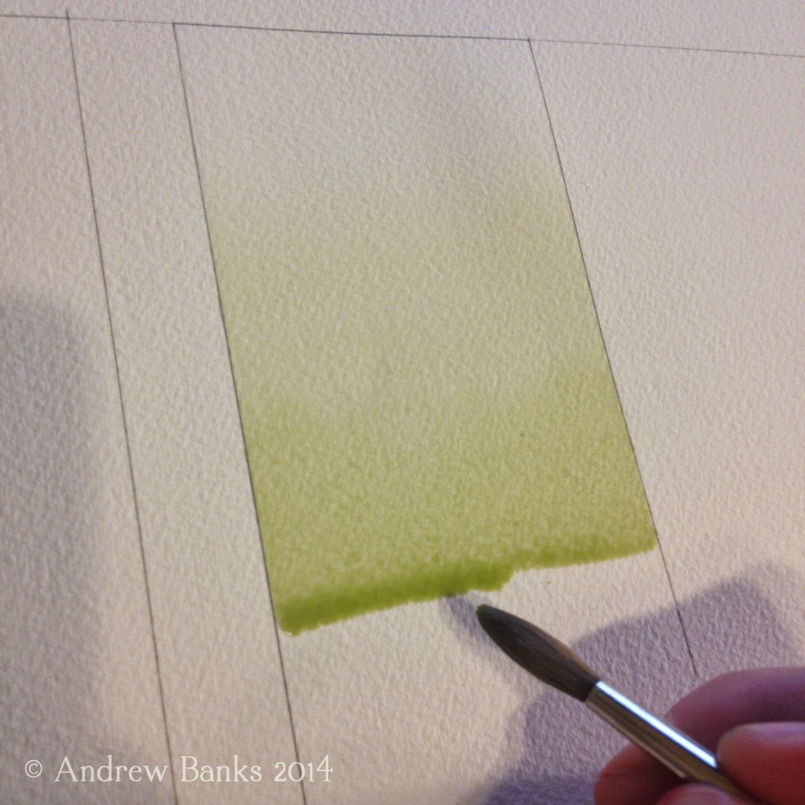
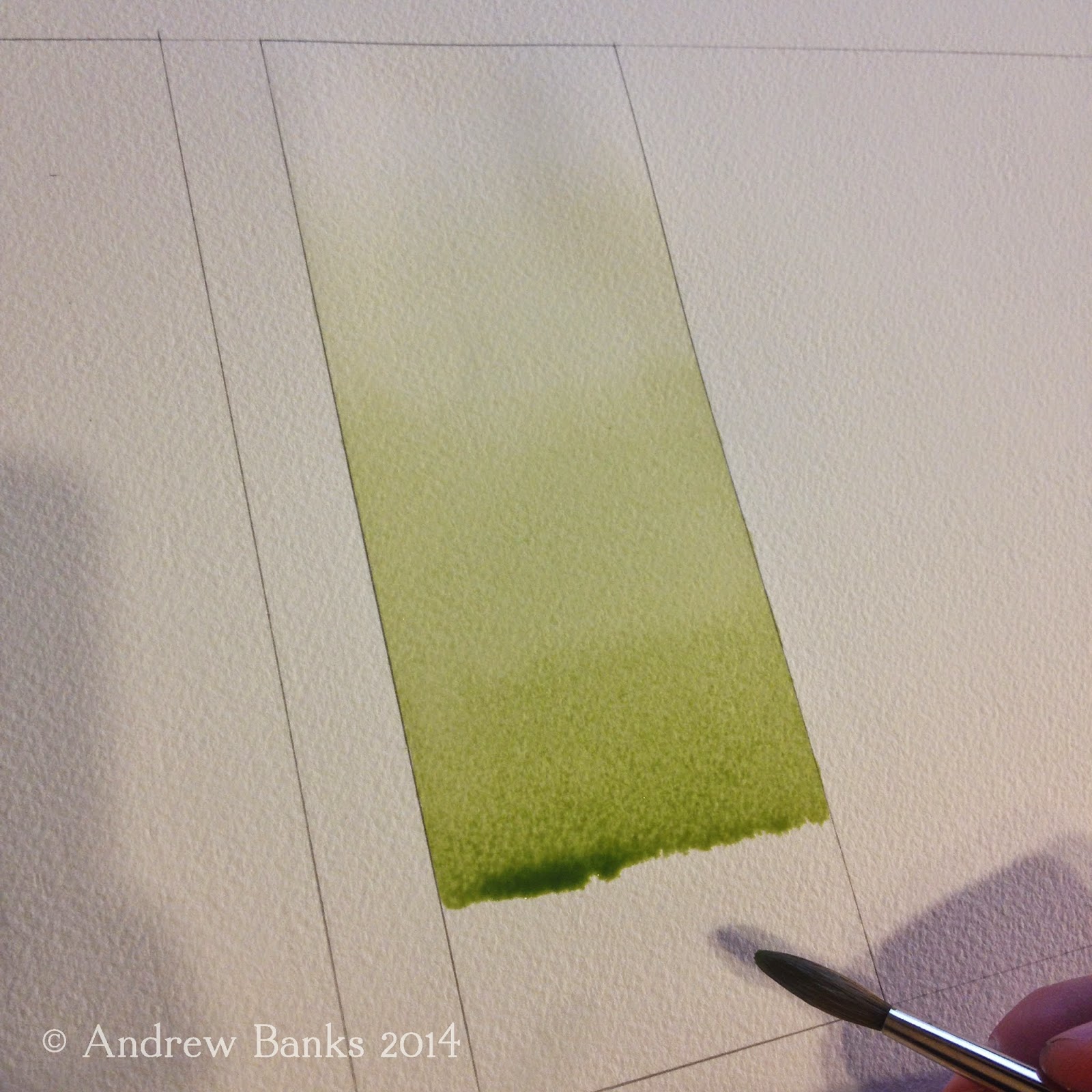
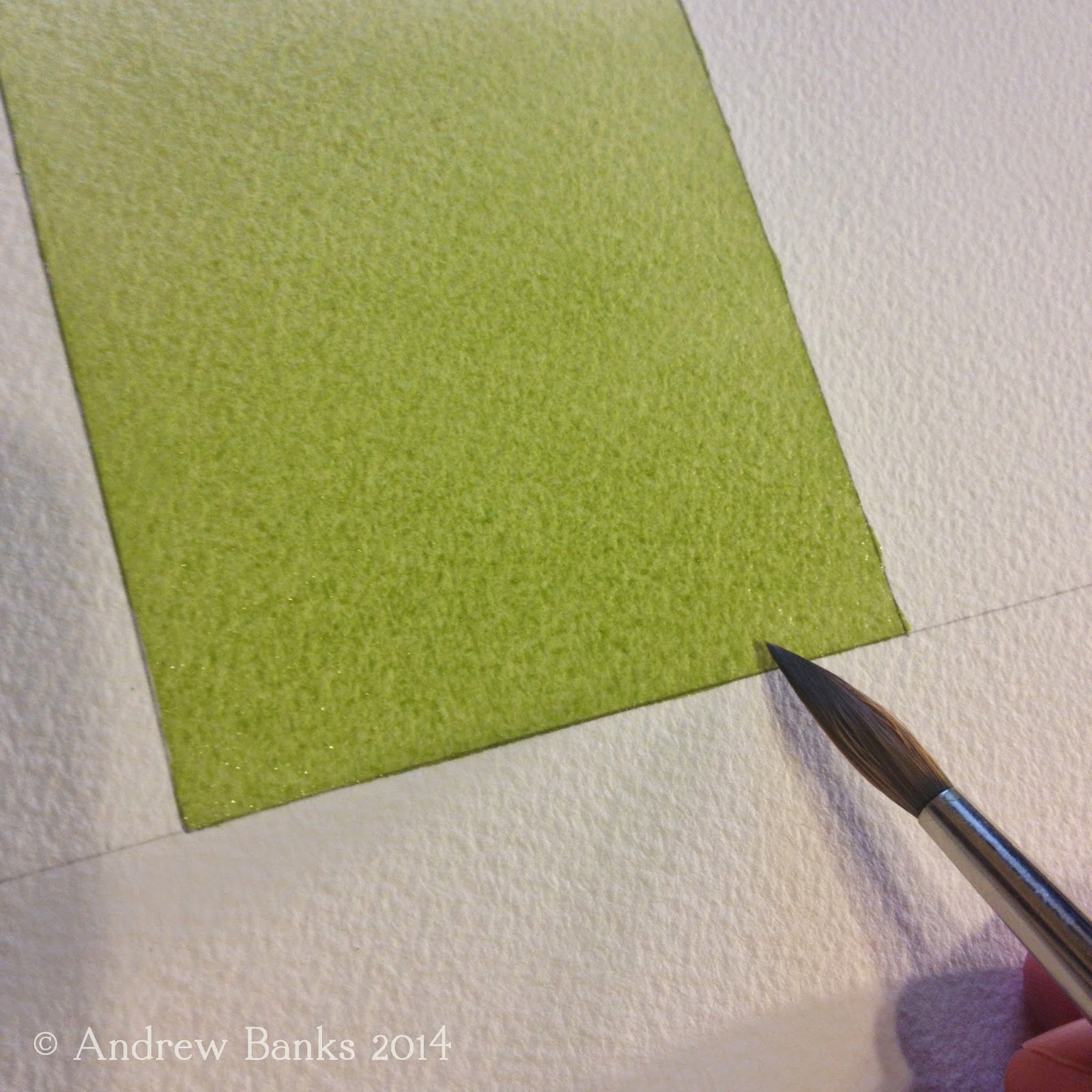
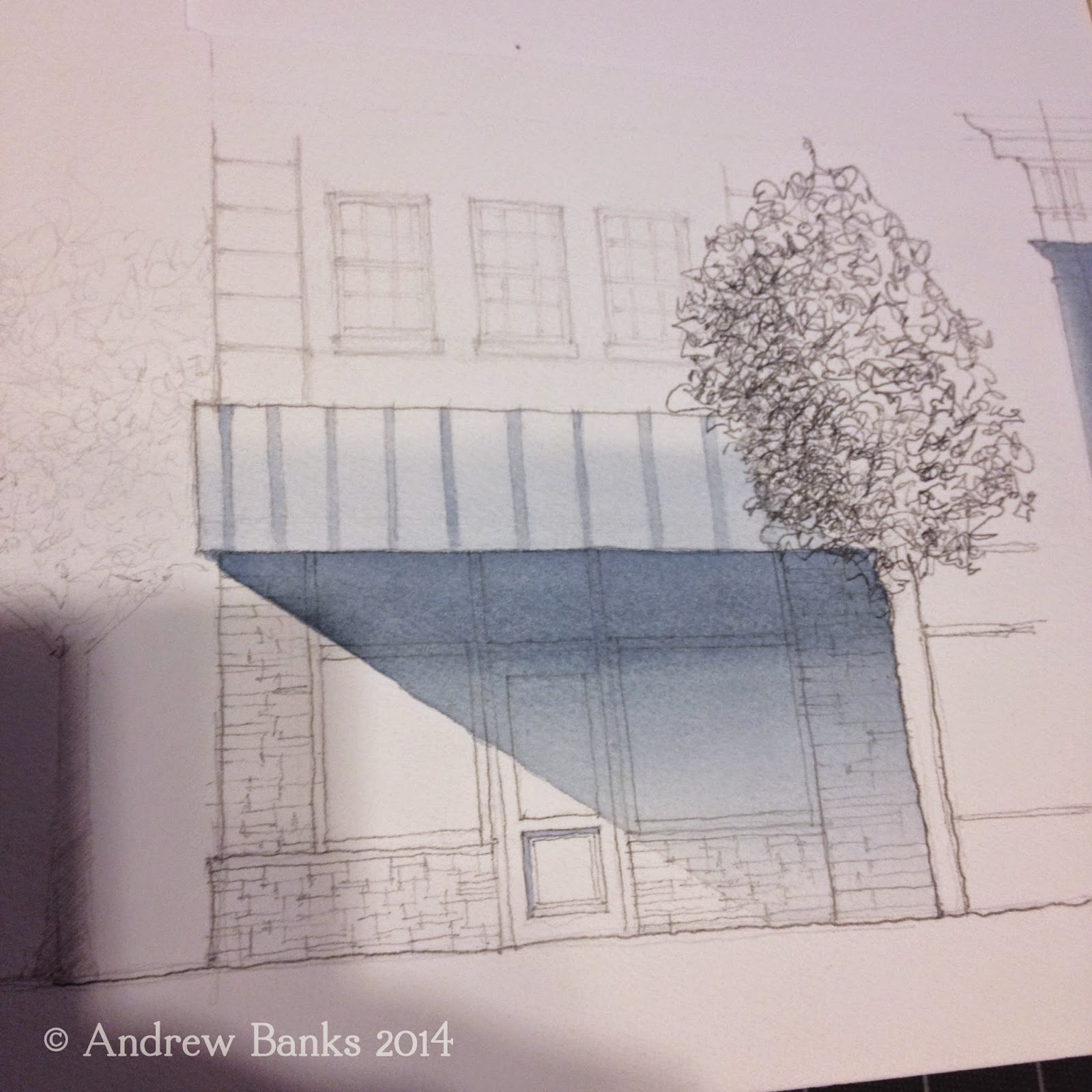
This week I sketched the same building with three different pens, just to see.  I used blank note cards from Paper Source. They are inexpensive and hold watercolor fairly well considering they aren't watercolor paper. That means they are just about perfect for sketching in my opinion!

Building sketch on Paper Source blank note cards  in (L – R): Micron .5 , Uniball, and Sheaffer Skrip ink in a Lamy EF nib

Here are the pens I used from left to right:

A. Micron .05: Generally when I sketch around the city I use a Micron .05–.005. I like the level of detail it allows for and it dries quickly without the risk of smearing – by hand or water! Some folks find the smaller tips too scratchy to enjoy.  I like the way my .005 occasionally skips to give me some line variance.

B. Uniball micro roller ball: These pens were the first ones I ever saw suggested on a sketching blog. They are advertised as having fraud protection ink (for checks). In theory they are water resistant, but depending on the paper I've found they will sometimes smear. Also, these skip badly regardless of the paper. I love their line, but they skip too much for me to use all the time.

C. Lamy Safari (EF nib): I used a rich black ink I inherited from an older relative in this pen. Shaeffer Skrip black ink (date unknown) to be precise.  It flows without skipping from the EF nib, but it takes a long time to dry, and if it once had water-resistant properties they have not stood the test of time.

Sketches with watercolor
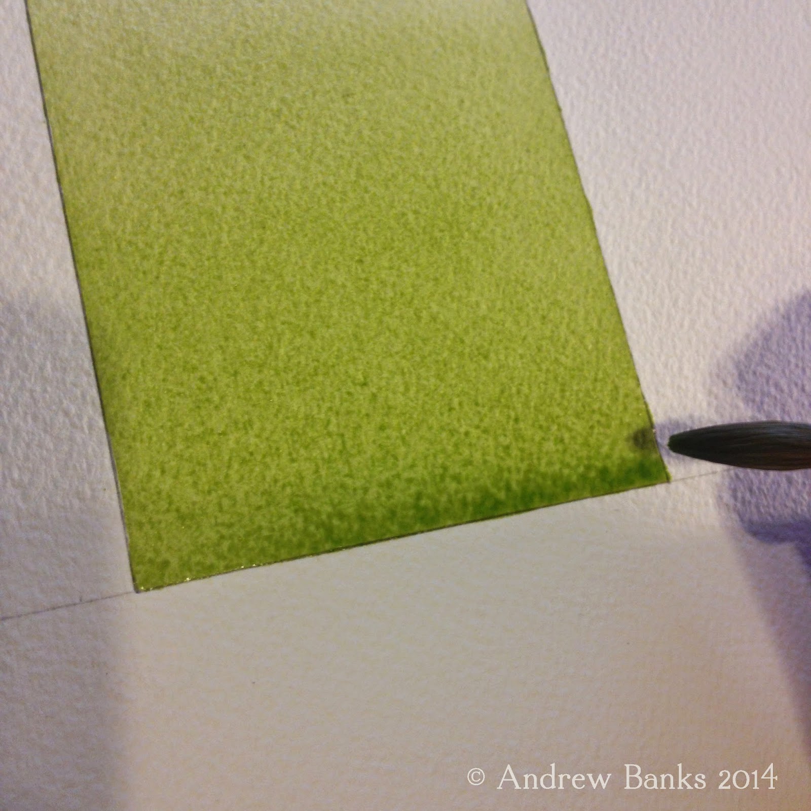
I used the same three colors on all three paintings and tried to use similar "wetness" in each piece to see how the ink would respond. As expected, the Micron and Uniball did not move much. Because I let the ink dry for about thirty minutes, the Shaeffer ink didn't smear as much as I expected either.

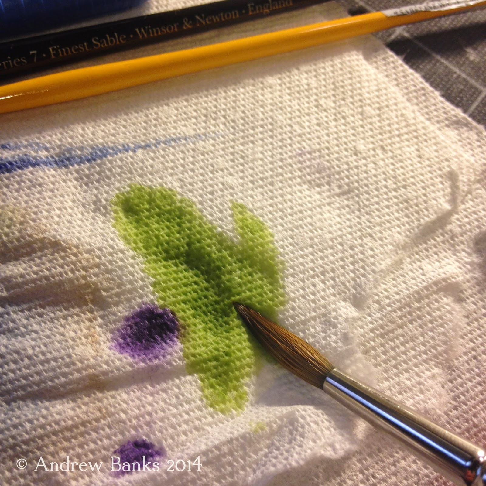
However  I was surprised at what a difference the moveable ink made when I was blending colors on the paper! The undertones in the ink made a marked difference. In some places this blending had a muddying effect. In other places it seemed that the ink colors added to the pigment of my paints.

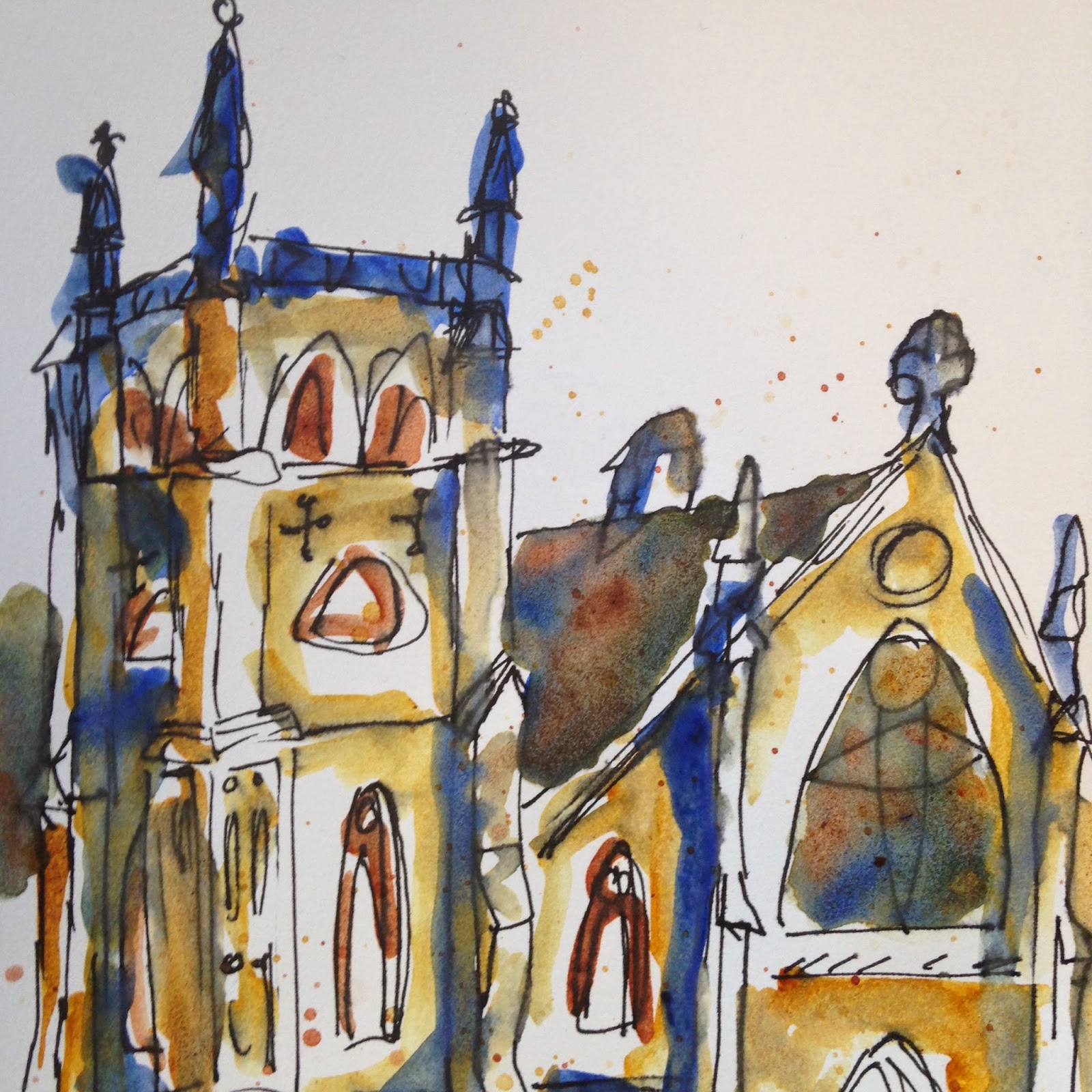
Detail from above, right.
You know what else I discovered? 

I liked the painting with the smeared lines best! What I had thought would ruin my sketch turned out to be a technique I want to continue using.

Do you ever intentionally mix "un-mixable" elements in your sketches? How do you feel about intentionally ruining your sketches? What makes a "ruined" sketch for you?

Tuesday, February 10, 2015

Tackle your Toolbox

Ever put the wrong color on your sketch? Realize you didn’t bring along any water-resistant pens? Forget which pen skips on watercolor paper? Stare at a completely blank sketchbook afraid of making the first sketch? Or maybe you hoard art supplies and can't remember which palette has your favorite yellow? (Oh, maybe that's just me.)

Today’s Tuesday Tips and Tricks is my favorite way to help prevent some of those bumps in happy sketching. It’s especially fun because it involves using your tools!
Sketch & originals of my current palettes and tools
That’s right this is about sketching your tools.

 My solution to help prevent all these problems? Sketch my tools in each sketchbook.


Tools on paper over back cover of S&B Zeta Sketchbook
Depending on the book’s purpose, I like to chart out my tools in the front or back of the notebook.  With my first Stillman & Birn sketchbook, fear of a huge stack of nice blank paper kept it that way for nearly a month. Finally I decided to sketch my palette on the back of the front cover to help me get over my fear. It worked and I’m happily filling it with paintings! However, in the smaller watercolor sketchbooks I carry for Urban Sketching, I prefer to make a chart or drawing in the back. When I’m out sketching I find it easier to reference a chart in the back than in the front. In my Zeta series Stillman & Birn sketchbook, the endpapers are so close to the rest of the pages that I sketch my tools there. Those of you who received sketchbooks at last year's seminar should check the end papers in your sketchbooks--unlike other sketchbooks I've used, these are high quality and can often hold watercolor!

How to get started? Well, you can always just jump in and get started making up your own method. For those of you who less inclined to experimenting, there are great examples by other Urban Sketchers, like Liz Steel with USK Australia, who sketch their tools often. Here are some ideas to get you started and examples from my sketchbooks:
Here I only draw one pen & pencil to represent multiple variations

Pens:
  • Draw one pen to represent multiple pens of the same type in different widths. Draw a line from each pen coming from the tip or under the pen and label its size.
  • Draw your pens and make a line coming out the tip of each. After all have dried, take a wet brush or q-tip and run it over the lines so you can see (and refresh your memory about) how each pen handles water.
  • Draw only your top three favorite pens. Sure your favorite may change in a month or so, but this will help you see which types of pens you like best over time.

Watercolor Pencils:
  • Draw a watercolor pencil and a swatch from each color under it. Label each swatch with the color name on the pencil, then wet half of each swatch to see the color wet and dry.
  • Make swatches of your pencils inside a rectangle or square to keep your pencils together. Label each swatch with the color name on the pencil, then wet half of each swatch to see the color wet and dry.
This was my first watercolor chart in the back of a pocket Moleskine


Watercolors:
  • Draw the palette you want to take on your next sketch outing and fill in each pan with the appropriate color. Leave the     colors flat to see how they’ll look on the paper or practice shading to show the texture of the paint.
  • Draw all of your palettes to help you remember which ones have certain colors without having to test them all again.
  • Paint a stroke of each color on the page where it would appear in your palette. This quick method is still a great reference in the field. 

What about you, how do keep track of your tools? Are there tools not mentioned here that you bring along to sketch with?

Thursday, February 5, 2015

Snow? Into the Field!

Narwhal facsimile (on watercolor moleskine)
Itching to sketch during this snow pile-up but hoping for something more dynamic and...well, warmer than the snow?

I was on Monday, so I trekked downtown to the Field Museum of Natural History. If you've never sketched at the Field Museum, take my advice and don't wait for the meetup at the end of the month!


female ruby-throated hummingbird (on Stillman & Birn Zeta)

Whether you prefer sketching people, animals, objects, or architecture, the Field has amazing exhibits to suit a sketcher's fancy.

On this visit I explored part of the "Ancient Americas" exhibit -- stunning artifacts and a life-size replica of a pueblo interior. But to be frank, I barely got beyond the "World of Birds" exhibit. Between bird-song playing all around and vibrant birds in replicas of their habitats, I was proud to not spend my entire visit in front of a single display case!

 For those who feel self-conscious about sketching alone in public, the Field is a great "sketch alone" location. The other guests are so involved with the exhibits that unlike subjects on the CTA, hardly anyone realizes someone is sketching!

woman reading by water buffalo exhibit (painted in watercolor molsekine)
The Field is also among the most artist-friendly museums in the city. Pencil, pen, watercolor, and nearly any other media are welcome (excluding acrylics and oils). Many exhibits have strategically placed seats, but if you don't want to risk not finding one near that perfect scene, artists are welcome to bring their own chairs. (I brought my folding chair, but ended up taking advantage of provided seating and an excuse to practice sketching while standing.)

Still need a reason to go sketch at the Field? Basic admission is free to Illinois residents the entire month of February!


Tuesday, October 28, 2014

Graded Wash in Watercolor

Tuesday Tips and Tricks

Watercolor is a great tool for urban sketching.  In this post, I will show you a technique I use frequently in both urban sketching and my professional work.

Watercolor is a delicate media and can be frustrating to work with if you do not have some basic steps to work with.  Graded washes are a helpful skill to know when wanting to capture light, shade and shadow.  In nature, light rarely hits a surface as a flat tone.  Factors such as the orientation of the subject, the context of the subject and the direction from which the light is coming from all impact how light appears on the subject. 

Here is a step by step process for creating a smooth, graded wash with watercolor, followed by a few practical applications for graded washes:

Creating the Graded Wash:


1)
Hold your sketchbook or paper at an angle to allow the watercolor to flow down the paper.  About a 35 degree angle works well for me.  If the angle is too high, the water will drip too fast for you to control.  If the angle is too low, the paint will not move fast enough, could cause unwanted buckling of the paper and will not allow for a smooth wash.

2) Load brush with completely clear water.  Apply clear wash to paper, creating a bead, allowing the water to gather slightly.  (If your angle is just right, the water will stay where you guide it.)  Make sure there is an even amount of water in all parts of the bead.


3)
  Load your brush with a highly diluted watercolor wash and introduce it into the clear wash before it has time to soak into the paper and dry.  With downward brush strokes, pull the bead of paint down the page.  You will begin to see the pigment from your brush get pulled into the clear wash.


4)
Load your brush with a slightly more pigmented wash and introduce it into your bead, continuing to pull it down the page.  (Work on doing this quickly.  If you allow the bead to dry, you will be left with a line of color that will interrupt the graded wash).


5)
Load your brush with the highest pigmented wash and continue to pull the bead downward.


6) Bring your bead to your desired edge or location.  Shake the brush off of or touch the brush to a paper towel to absorb the excess water.  Gently touch your dry brush to the bead.  Your brush will absorb the excess water back into the brush, leaving an even surface of paint on the paper.  If we left the bead of water on the paper, the excess paint would diffuse back up into the earlier wash and would create an unwanted stain.


7) Repeat steps 2-6 until you get the values you want.

Graded Wash Applications:
Here are just a few examples of applications for graded washes

Shadows
Here, the graded wash works perfectly for a shadow cast on the underside of an awning.  On a sunny day, light will reflect off of the ground surface back on the building wall.  The graded wash allows you to show this reflected light gradually darkening as it gets farther from the ground and up under the awning.


Curved objects
Curved objects have a range of tones (highlight, mid tone, shadow, reflected light, cast shadow) that can be achieved with graded wash.

Skies
Depending on where the sun is in the sky, the sky will have a graded wash.  For example when the sun is low on the horizon, the graded wash will be light on the horizon line and darker the higher you go into the sky.  When the sun is higher in the sky it is generally the opposite.

Sunday, January 19, 2014

This Urban Sketcher Went to Market


Whole Foods, Lincoln Park: Despite the snowy, gray day we had a good turnout for our January sketch meet. So many scenes to sketch! I've been to this Whole Foods many times but never on a Saturday afternoon. It was a madhouse mixture of fun, comradery and business and not just USk Chicago sketchers. Sketchers and shoppers alike seemed to be enjoying themselves. Not only did we have a great time sketching but we also continued out work on the plans for Chicago Sketch Seminar coming in June. 

Part of the USk Chicago group at Whole Foods
For more information on the seminar don't forget to check out:
Urban Sketchers Chicago Instagram: #uskchicago
Follow up in Twitter: @USk_Chicago


Tuesday, October 15, 2013

Add Some Life to the Drawing


One of the most rewarding things about Urban Sketching and the USk community is the culture of sharing, critiquing, teaching and learning that happens here.

If you look at my sketches, you'll notice that the majority of what I draw is Architecture.  I draw it more than anything else simply because I really enjoy it.  I'm also more familiar with architectural forms because this is what I got a degree in.  I guess you could say it's my go to subject.

It makes sense too, right?  You can hardly escape drawing architecture in an "urban sketch."  If you are sketching people in a coffee shop for example, you're most likely going to draw the coffee shop you are in to give some context.  Or if you are walking around on the street and decided to sketch oh I don't know, a street festival that happens to be going on, it's going to be really hard not to include some of the architecture that's all around you.

So I sketch Architecture.  But a huge part of urban sketching is capturing a sense of life in a given sketch. Who is there?  How many are there?  What are they doing?  How are they using the space?  Are they having a good time?  Not only does including people bring your sketch to life, but it also add's a real nice sense of scale and proportion.

In theory, I know all about these things and how to use them, but actually including them in my sketches has been a different story.  Figure drawing is difficult for me, but I've been challenged and inspired by other sketchers to add more "life" to my sketches.

I took the advice and really liked how this last sketch of mine turned out.

Monday, October 14, 2013

Sunshine and Sketching – An Urban Sketcher's Delight


Lincoln Park: Today was the perfect day to sketch outside. There was more than a touch of fall in the shade but the sun was golden and warm. Time flew by! I usually don't sketch the architecture. People and other living things are what catch my attention. Today, I think, I had Urban Sketchers Chicago's next Sunday's architectural sketch crawl on my mind and so the Conservatory caught my eye. It's a little over worked but I had a fun doing it and that's what urban sketching is about for me!

I'm down to the last pages in my Stillman and Birn hardbound Beta Series sketchbook. I really love the hardbound book but no one seems to carry them around here. If you know where I can find them please let me know!


Tuesday, August 20, 2013

Chinatown Revisited


Sunday, I went sketching with the Urban Sketchers Chicago group.  It was really wonderful to meet some sketchers I had not met before.  We revisited Chinatown, where we had sketched last year.  We are thinking this should be a yearly event.
I arrived early (really?), so while I waited for the others to appear, I did a few sketches, sitting on Cermak Road, facing north.  The first sketch is a portion of the Three Happiness Restaurant, and the view up Wentworth Avenue.
(Pencil, Micron pen, watercolor in Holbein post card book)

Next, I sketched people who were passing by or standing around.  I loved the young woman who was listening to a tour group leader giving a lecture.  The young woman kept fidgeting her legs around, while keeping her arms crossed.  Even from across the street, it was obvious that she was bored out of her mind!
(Pencil, Micron pen, watercolor)

The next two sketches were done at Chinatown Square, a block or two north of Cermak Road, on the west side of Wentworth Avenue.  We were happy to discover that there was a Chinatown Festival happening – and it was very festive!  We were entertained with music, young children dancing, many different people and even a procession of monks.  I set up my little, bum-numbing stool, and began to draw.
When I finished the drawing of the horse sculpture, I acquired a small fan club – two young girls, around 10 and 11 years old, and their twin cousins, the most adorable four-year-old boys.  The older girl asked me to draw Angry Birds.  (I had to use my phone to find an Angry Bird to draw – the red one, of course!)  Then the boys had to have Angry Birds as well.  One of the boys asked me to draw a big house.  (The house I drew could only have been inhabited with stick figures!)  While I was drawing and looking down at the paper, one of the boys kept putting his face under mine, bringing our foreheads together, and staring into my eyes.  I’m not sure what that was about!  Then the younger girl asked me to draw flowers.  I drew everything and gave them the pictures.  They hung around for about an hour – a very appreciative audience – and I enjoyed it immensely!

(Both pages done with pencil, Staedtler pens, Micron pen, and watercolor 
in an Arches Travel Book, 140 lb. paper)

I copied the symbol for “horse” from the base of the sculpture.  Then, the oldest member of my fan club asked if she could draw the “new” symbol on my page.  I was delighted with that!  All in all, a great day with the Urban Sketchers!


Sunday, July 21, 2013

Sketchcrawl at Lincoln Park Zoo 7/21/13

Lovely day for being outside sketching.
Used the Caran D'ache watercolor leads on this one.

Ink and wash

Watercolor with no preliminary drawing. I really like doing it this way.