Pages

Tuesday, April 28, 2015

Color - Part 3 - Contrast

Tuesday Tips and Tricks


I hope you remember that we started talking about color theory in previous TTT posts. It was a little while ago, so I will remind you with links: Color - Part 1 and Color - Part 2. Today we will continue talking about color and will discuss contrast.

Contrast is an easy concept to understand. Renaissance painters mainly used value contrast; the Impressionists relied on temperature contrasts. But there are more contrasting relationships available to artists, we will talk about severn different ones.


1. Hue Contrast

Strong intense colors placed side by side produce powerful and dramatic contrast. Children and artists working in style called Primitivism use this contrast very effectively. Use as many colors as you like as long as they are pure and bright. If you add an olive green or a mustard yellow to the mix, the combination will stop working.
Hue contrast
2. Value Contrast

The squares with greater value contrast capture attention. The lighter squares seem to be filled with light and darker squares appear somber.
Value contrast

3. Color Key

Color key brings drama to artwork. High-key colors, like tints and middle tones at the lighter end of the value scale, are usually pure colors that suggest bright illumination, making the work cheerful and optimistic. Low-key colors, such as low-intensity and dark values, indicate dim illumination, create serious, sad or pensive mood.

Sketch in high color key by Alex Zonis


4. Intensity Contrast

Pure color stands out against neutral gray and low intensity background. The contrast decreases against the same hue background

Intensity contrast

5. Complementary Contrast

Complementary colors are the opposites on the color wheel. Placed side by side they enhance each other. Mixed together as paint they neutralize each other. Tertiary complements make unusual color combinations as they are less common.

Complementary contrast


6. Temperature Contrast

It may sound strange to talk about temperature of color. However experiments demonstrated a difference of 5-7 degrees in subjective feeling of warm and cold in rooms painted blue-green and red-orange. On the color wheel Red-orange is the warmest color and blue-green is the coolest. We can achieve multiple effects working with color temperature:

Cold - Warm

Shadow - Sun

Sleepy - Awake

Airy - Earthy

Far - Near

Light - Heavy

Wet - Dry

Impressionists relied on temperature contrast rather than value contrast to suggest light. Warm and cool contrast provides movement around the form, because warm colors appear to come forward and cool colors recede into the background.

Temperature contrast


7. Quantity Contrast

Quantity contrast is a powerful visual tool and one of my favorites to use. It is like an exclamation point in language, used right it is very expressive and impossible to miss.

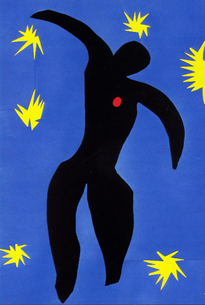
Henry Matisse - Icarus


Tuesday, April 21, 2015

The Gift of Foresight

Give yourself the gift of foresight.

Sometimes in urban sketching we stumble upon something that needs to be captured in the moment. Other times we know a general type of thing on our sketching menu. For instance you might consider that you'll be in public transit a good deal for the next few days or perhaps you know you're meeting a friend in a park with joggers.

When you know what type of thing is coming, give yourself the gift of foresight. What does that mean? Well mainly it means taking time between sketches to practice techniques for capturing something you anticipate seeing.

Do you struggle with quick sketches of people? Does your lighting source chance too often in a long sketch? Do you have trouble scaling objects on your page?

If you know an area you struggle with is on your sketching menu take a little time and practice at home. By giving yourself a set time to practice one of your trouble areas on a something in your house or even from a photograph you can try out new techniques without the pressure of your subject escaping.

Bent-nib fountain pen sketch


This weekend many of us will be meeting up at Cloud Gate – The Bean – and frankly sketching reflective metal is not high on my skill list.

So one evening I found a metal water bottle and tried out a few different techniques for capturing the reflective element that always alludes me. This time I only worked with techniques I generally use for sketch outings. While there are benefits to trying new techniques, I wanted to see what was and wasn't working with my standard methods.

watercolor without sketch guides


First I worked only with a "bent-nib" fountain pen (by Sailor) loaded with black ink. Next I tried watercolor in only black and blue and without a base sketch. Finally I sketched the bottle again with a fountain pen and wet the ink with a touch of blue watercolor to see how the colors would shade.

Fountain pen sketch with watercolor

Trying out several techniques on the same object helped me pin point the strengths in certain approaches so that when Saturday rolls around I'll be better prepared to sketch without hesitation.

Have you every planned ahead when it comes to what you practice? What else do you like to practice before a sketch outing?

Tuesday, April 14, 2015

Don’t Look Now!

Well, don’t look at your paper; do look intently at your subject and draw it. 


Tuesday Tips and Tricks

Blind-Contour Drawing 


Too Much Espresso


 A blind-contour drawing is essentially drawing the outline of your subject without looking at your paper. I’m using the term contour rather loosely. It’s really a combination of contour and continuous-line drawing. Doing blind contour exercises can have real benefits for your sketching technique.

How?

  • Choose your subject and decide where you are going to start. 
  • Put your pencil, pen or marker on the paper at your starting point and begin.
  • Do not look at your paper until you are finished! I know it’s hard but don’t cheat.
  • Believe your pen is touching the edge of your subject and begin to move along the form with your eye on your subject and your pen on the paper. Imagine your pen feeling the line, the curves, each nook and cranny.
  • Draw without lifting your pen off the paper.


Selfie–Yikes!

Hints:

  • Think in terms of line, shape, direction, sharp, rounded, etc. rather than objects.
  • Draw at a consistent pace.
  • When you reach a point where two lines intersect or two forms meet you don’t have to stay on the outer edge but keep your pen on the paper.

When you’re back where you started take a look at your drawing. You’ll probably see some distortions, way off proportions but some areas may be remarkably accurate. You may also see an energy and sensitivity and an expressive line that aren’t present in other drawings. Whatever you see there are real benefits to blind contour exercises.

One Hanger,Three Times

Benefits:

  • Improves your eye-hand coordination.
  • Encourages you to draw what you see, not what you know.
  • It helps you understand your subject.
  • You become more involved in the process rather than product.
  • Continuous-line, blind-contour drawings are a great way to warm up for a drawing session. 
  • For urban sketchers it’s good experience for when we’re drawing in the dark, in our pockets or under the table!
  • It’s fun.
If you enjoy our Tuesday Tips & Tricks you'll love our July sketching seminar! Check it out on FB, Twitter, Instagram, Pinterest and our 2015 Seminar Blog!

Tuesday, April 7, 2015

Urban Drawing Tools

TUESDAY TIPS & TRICKS

I am a graphic designer by trade and I bridge that transition between the old school art supplies (like you see on the AMC TV show "Mad Men" art department) and the invention of the personal computer. Simply put, I use a lot of drawing templates and old-school art supplies when I sketch. I am used to cleaning up my sketches with straight edges and ellipse guides to create sketches that are in reasonable perspective and scale.

Most times I am only armed with my sketchbook and a pen. For those times I will freehand my circles, ellipses and straight-edged objects because I have been drawing long enough that it does not intimidate me. But if the opportunity presents itself, I will do a little searching within my surroundings to see if I can't produce a reasonable substitute for a ruler or drawing template. If you aren't opposed to rummaging through a recycling bin or the utensil bin at a coffee shop, you can discover all kinds of free art tools. 


The following are my suggestions of found objects to help you realize that art supplies are all around us if we only look for them.


Other found items that I have often resorted to as make-shift drawing tools include (for a straight edge) a notebook, a yardstick from the hardware store, a piece of cardboard from a pizza box, and a board from a construction site. For a circle I have often found a piece of string with a pencil tied to the end makes a great compass if you hold the loose end down and draw around it. Also every cup, vase, planter, music CD and jar also provide lots of diameters with which you can find the right size circle.

Long ago when I was a member of the Boy Scouts, we even whittled end of a stick and dipped it in ink to create a rustic fountain pen on paper. You can get some pretty interesting lines from a twig that has a sharpened end. I am sure there are many more items that you will discover. Please go out and explore and let me know what you have found that works as your quasi-art supplies in the field. The important thing is to have fun.

What are some of the drawing tools you have found in the wild? Please share :)