Pages

Tuesday, March 31, 2015

Sketching Architectural Details

TUESDAY TIPS AND TRICKS


If you have ever finished a sketch, held it up and compared it to the actual subject only to realize that something about your sketch was just not right, this post is for you.

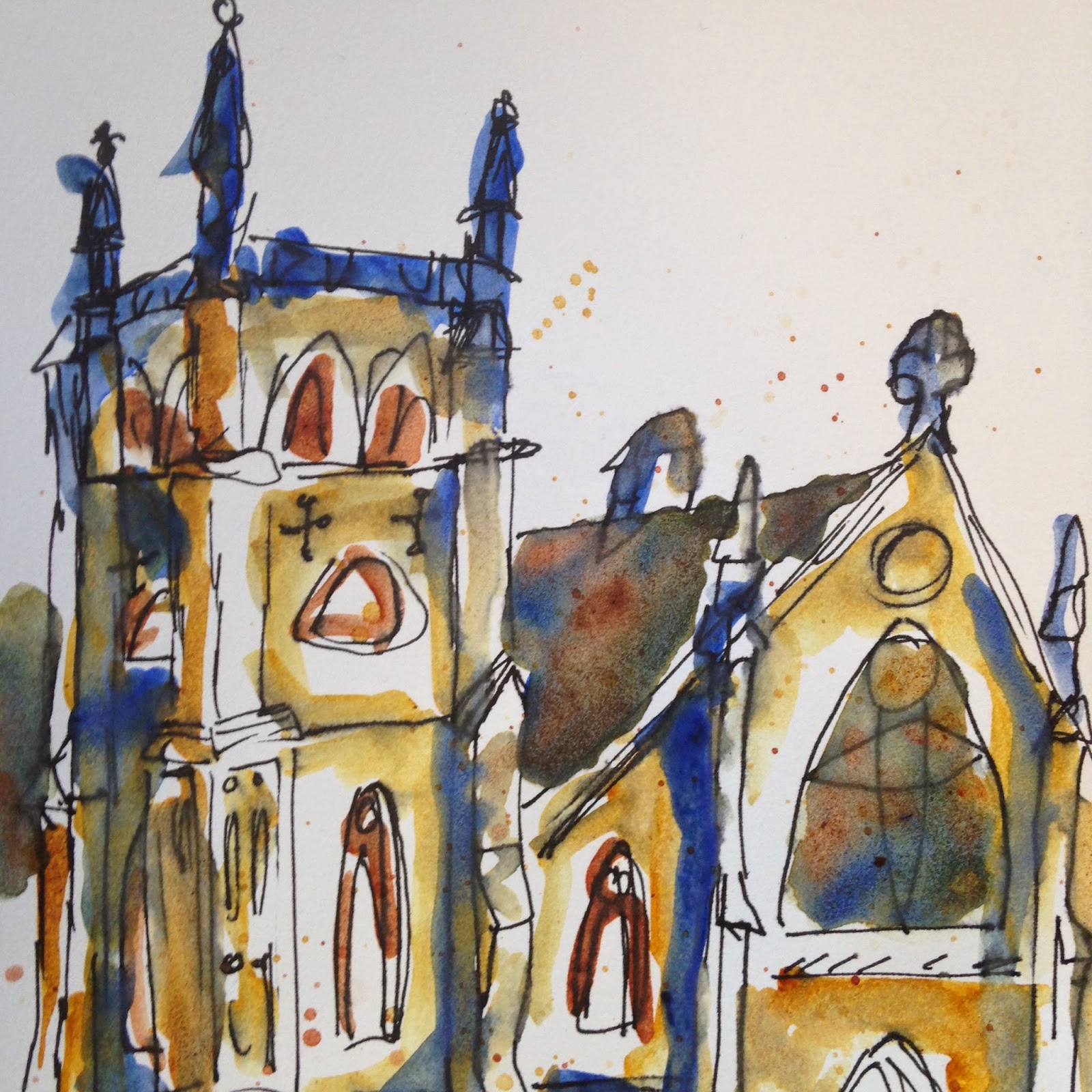
Between Barbara Week's recent post entitled "Off The Grid - Designing a Page" which talked about guidelines as compositional tools, and a recent architectural sketch I made, I wanted to "piggy-back" off of the topic of guidelines in urban sketching and talk specifically about how guidelines can help you simplify and map out the different parts of architectural details.

Buildings and architectural details can seem like daunting subjects to draw.  Thankfully, there are several observational cues to pick up on that will help you map out your drawing and establish an educated guess about the sizes, proportions, patterns and elements that make up your specific detail.  You don't even need to know the technical names of the architectural elements, or how they go together.  You just have to have the ability to make observations.  After all, that's half the battle of urban sketching is, isn't it?

(A couple quick side notes: 1.Check out a couple of my previous and related posts for a more full set of tips on architectural sketching.  "Perspective for the Urban Sketcher" and "Drawing Architecture: Sighting Size and Proportion" AND 2) these ideas can be applied to other subjects including figure drawing, landscapes, and most other types of subjects as well.)

Here is the scan of my sketch.  As you can see more clearly here than in the picture above, I used several guidelines in my initial pencil sketch before adding value in ink.  I left the pencil guidelines in for aesthetics.  Personally, I like how guidelines can add to the story of a sketch.  Guidelines show your process.  They add a level of technicality to the drawing. Many of the greatest artists left pencil underlays partially visible in their masterpieces. I think guidelines give an added personal touch, but this is just my opinion.
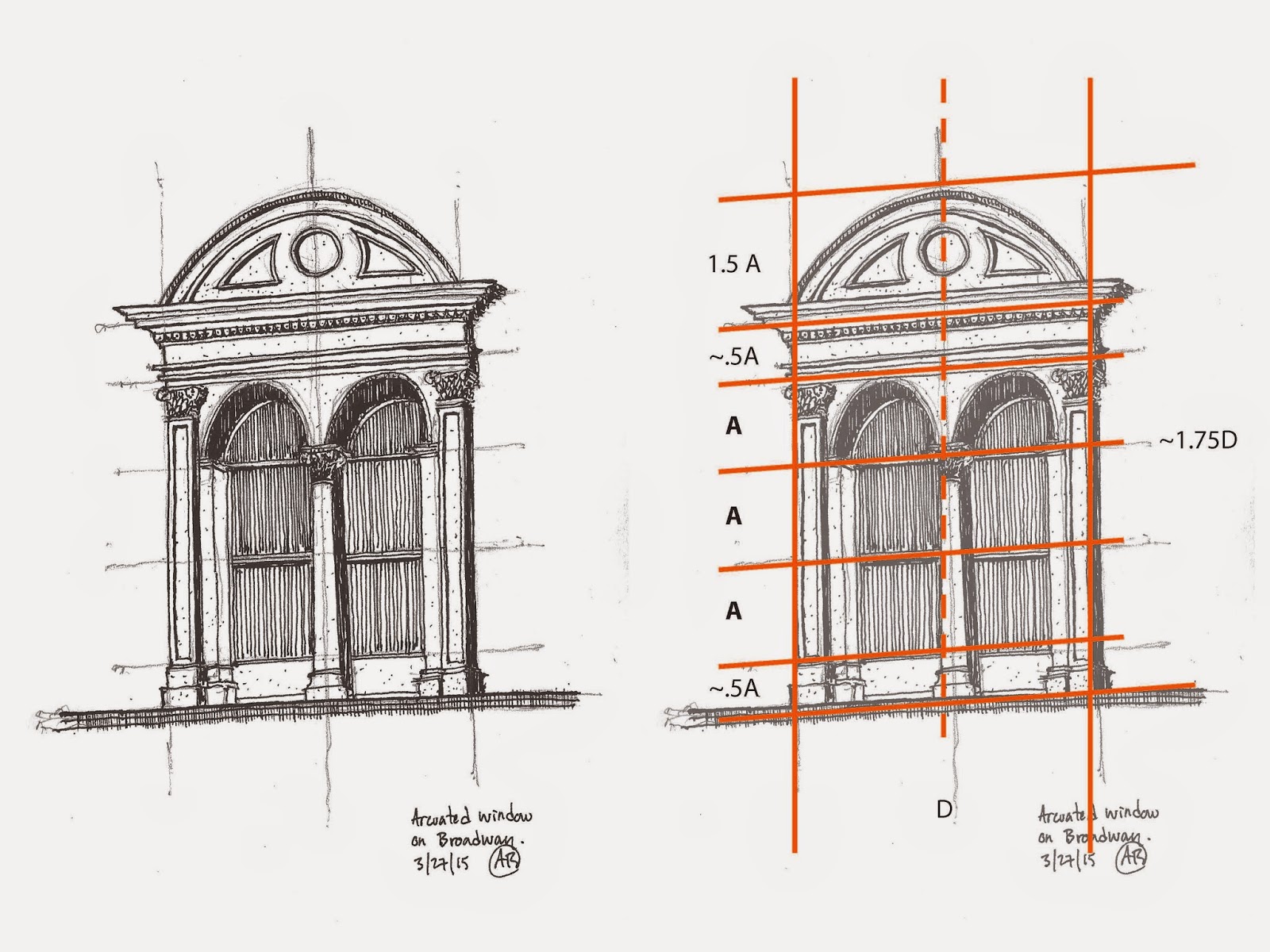

The image to the right is fairly self explanatory, however, I will share a little bit about how I approached this drawing.

I began by drawing the center line (dashed) guideline.  Since this detail is symmetrical, the center line is the most important guide to get you started.  Recognizing that the left and right sides of the detail have the same width, I added two more vertical guides, spaced equally as far away from the center line as I could have approximated while standing up, holding the sketchbook.

After I had determined the overall width of the detail, I used the sighting technique (explained in more detail here) to approximate how many widths (D) tall the detail was.  I found that the details was about 1.75 widths (D) tall.  Basing all of the approximate sizes off of one or two of the dimensions in your detail will help you keep all of the different parts of the drawing proportional to the detail as a whole and in relationship to one another.


I then drew a few horizontal lines.  I found larger shapes that I could use as benchmarks for the detail, so to speak.  So as you can see, (bottom to top) my horizontal guidelines fell on the base of the column, the center line of the window, the top of the middle column, the top of the two side columns, the bottom of the entablature, as well as the top of the arched pediment at the top.  Like in all other forms of design, there is a method to the madness in this detail's composition, which is why the sizes of A, .5A and 1.5 A all work well together, and were easy to approximate.

I drew the guidelines at the center line of the window, the top of the middle column, and the tops of the two side columns first.  A quick approximation told me that the bottom and top portions were half the height of A, and that the curved pediment on top was about 1.5A.

Now that the major heights and widths were mapped out, I filled in all of the rest of the details. (Column capitals, window mullions, arched openings above windows, additional lines on the entablature, as well as the dentils in the molding).  I did not draw guidelines for every single detail (although if you want to you can.)  Instead, since the major sizes and proportions were laid out, I could then "eyeball" the sizes and proportions of the smaller details since enough information was already mapped out for me.

This is something that may take a while to get the hang of, but once you do it a few times it will begin to make more sense.  At first, sketching like this may take a little longer than just "winging it".  However, the more you do it, the more it will make sense and will end up increasing your sketching speed in the end.  Learning how to sight size, proportion and perspectives were the most valuable urban sketching skills I learned when I was first introduced to urban sketching.  They are skills I use in almost every sketch I do to this day.

I hope this post, along with the previous posts on sighting and perspective are helpful.  Feel free to ask any questions.

Lastly, don't forget to follow us on Twitter, Instagram, and Pinterest.  If you live in the Chicago area, connect with us through Facebook.  We sketch as a group every third weekend of each month at different locations throughout Chicago.

Andrew


Tuesday, March 24, 2015

Stalking The Urban Sketcher Way

TUESDAY TIPS & TRICKS

Let's talk about people in urban sketches. In my first post for this Tuesday Tips & Tricks series, I wrote “How to Add People to Your Urban Sketches.” In this article I made the case for adding people in order to give your landscape sketches “scale and interest” by using various forms of stick figures. This is particularly useful when sketching people are not your forte. 

Well that post worked for a long time but now many of you have asked about the elephant in the room--how to sketch real people. “Wes, how do I sketch a complete unknown stranger when they are seated only a few feet from me? How do I sketch them without getting caught?” In response to requests such as this (and I recognize this real fear) I submit the following ideas for staying hidden while sketching your favorite subject.


I. POSITION YOURSELF FOR STEALTH SKETCHING
Sit behind your subject.
You will only get the back of their head but at least it will build your confidence and you can focus on the surrounding environment. Sometimes you can pretend to be looking at the back of someone's head and over their shoulder is a more interesting subject (sneaky).

Sit across the aisle or across the room from your subject.
By positioning yourself so there is a protective barrier of distractions, you will be better able to focus on your subject without them “feeling” your eyes. Just remember that the farther away you sit, the less details you will be able to observe. Wearing a set of binoculars on your head is no way to keep your anonymity.

Sit in a balcony or upper level above your subject.
By sitting above the line of sight your subject will not even notice your gaze. It does, however, challenge your knowledge and skills of foreshortening. Sitting in direct line of sight (or below them) makes you more vulnerable for being discovered because peripheral vision works best in a horizontal fashion.

Sketch with a friend.
Another tactic I have used from time to time is to invite a friend to breakfast, lunch, dinner, coffee, drinks, etc. Sit at a table across from each other and let your friend know that they have your attention but that you are also going to be sketching the person over their shoulder. This way your friend will not develop a complex if they think you are not paying attention. No one will suspect that you are sketching them if it looks like you are having a conversation with another person. If all else fails, sketch your friend while you talk or sketch each other.


 II. ASSESS THE COMPETITIVE LANDSCAPE
Find a subject who is totally engrossed in their personal electronic device. The funny thing about PDAs and laptop computers is that you could literally stand right in front of them to politely ask a question and they would never notice you until you said something. Perfect for staying undetected as a sketch artist.

Likewise, if you see someone who is reading a book, magazine or newspaper, their eyes are directed downward or blocked by the oversized newspaper so your subject may not notice you, even if you are seated in front 
of them.

If two people are engaged in conversation, they are usually focused on each other and will look away occasionally to collect their thoughts. They move around a lot with hand and body gestures, but they generally stay in the same spot. If you are lucky, or unlucky, enough to happen across a couple who is arguing EVERYONE in the room will be looking at them so you will blend in nicely.

If you see someone who has fallen asleep, BINGO! you have all the time you need to focus on clothes, wrinkles, clothes patterns, nostril hair and even all of the people who are wondering if this guy is ever going to stop snoring.

Lastly, wear a hat or sunglasses, if your surroundings permit, in order to hide your gaze upon the unsuspecting subject. By all means, try not to snap photos because that crosses over into the “creep factor.” People get all defensive about how another person intends to use their photo. If you have the time, sketching a person will improve your observation skills and people are generally relieved when they discover that you chose to sketch them--most times even impressed.


Enjoy and have fun. Next time I will cover some basics on the human anatomy and why clothes wrinkles look the way they do.


Tuesday, March 17, 2015

Off the Grid – Designing a Page


Tuesday Tips and Tricks

Many Urban Sketchers use sketchbooks as a journal of their daily lives and travels. We add titles, text, and occasionally ephemera to some of our pages. It’s a natural to want the composition of those pages to enhance our sketches rather than distract from them. One way I design a page is by using the grid method.

A grid is a plan made up of a series of intersecting straight (vertical, horizontal, and angular) lines, similar to graph paper. It provides the skeleton of a page. It supports the elements on the page and makes them work in relation to each other.

Years of working in print production designing layouts for magazines, promo pieces, etc. has given me a lot of practice designing to the grid. It's second nature to me and a sketchy version of aligning on a grid is my go-to method for designing pages in my sketchbook. In graphic design the grid comes first. In my sketchbooks it can show up at anytime. It can be the before or after guide for a loose alignment of page elements. I want to emphasize it’s a loose alignment. The casual use of the grid is in keeping with the spirit and look of sketching.

Where, How, When?

Applying a grid before the sketch 


When I’m  traveling I sometimes choose a theme for a few spreads. On this trip to San Francisco one theme I was exploring was the trees. I drew the four frames freehand before I did any sketching and added the sketches over a few days. To keep the layout from being too static I left a section open for a possible surprise. Note the top and bottoms of the frames align, the bottom of the surprise pine cone and the baseline of the lower text align. The title on the left balances the lower right text.

Applying a grid after the sketch 


These sketches were quick observations at the ice rink in Millennium Park in Chicago. The frames were hand drawn to unify the spread after the sketches were done . The frames are lined up on either the vertical, the top, or centered on another frame. The skater on the left escapes the frame for a little surprise and aligns with the frame around the coffee drinker on the right. 

When the muse strikes

If you use a ruler on the examples above you’ll find the alignments aren't labored over but are guesstimates. When I’m sketching it’s about the fun and joy of sketching and I go with the flow. I don’t always stick to the pre-drawn plan as you can see in the sketch below. Take note where the text is placed. Can you tell why I placed it where I did?


When disaster strikes

This is a series of doodles done at Starbucks in our local Target. One disappointing scribble after another provides the perfect challenge for the my grid theory.


Creating a loose alignment on the (or near) grid lines can strengthen your sketches and the composition of the page. The sketch below is a demo I did for the Urban Sketching for Beginners workshop at last summer's USk-Chicago's sketch seminar. Look at the line up of the added frames and the added text. They add organization to the page. If you want to give the post-sketching grid a try without committing use a piece to tracing paper to work out your plan.


One More Tip

I almost forgot the most important thing – no matter what the Tuesday tip or trick, be brave and have fun!

Tuesday, March 10, 2015

Ruin Your Watercolor Sketches!


Wait, what?

That's right, I said to ruin your watercolor sketch.

In my opinion there is no other sketching experience to compare with the horror of watching your lines unintentionally smear. 

I vividly remember the horror of the first time I put watercolor paints on a sketch in water-based ink. The sketch was in a Moleskine pocket watercolor notebook and I'd spent about an hour placing the fountain, shadows, and luscious leaf canopy. The green I was adding for the copper fountain smeared with purple from the black ink. I'm pretty confident that I threw away the pen I used that day. 

But following last week's tip and looking through my old sketchbooks I realized that I really liked my "ruined" sketch! Well, at least part of it.

Frustration with my disappointed ideal had kept me from exploring the potential of water-based inks in watercolor sketches. So I invite you to join me as I begin exploring intentionally challenging my ideal of hard lines.

Statue from the Field Museum on Stillman & Birn Zeta in water-based ink

Last week I tried two methods to help me play with this technique.

1. Add watercolors (or water) to a sketch you aren't happy with or didn't finish – regardless of ink!

I took some watercolor to an unfinished sketch from our outing to the Field Museum. I'd begun a sketch of a statue but lost perspective and stopped. Normally I'm happy to splash on color and see how things take shape, but I'd done this sketch with an ink I knew was not water resistant.

I added watercolor any way.

The water didn't suddenly fix all the problems with my sketch, but it did change it.  As my lines smeared I realized water on water-based inks was a whole new technique I hadn't considered.

2. Test the variations of water resistance in your favorite sketching pens

This week I sketched the same building with three different pens, just to see.  I used blank note cards from Paper Source. They are inexpensive and hold watercolor fairly well considering they aren't watercolor paper. That means they are just about perfect for sketching in my opinion!

Building sketch on Paper Source blank note cards  in (L – R): Micron .5 , Uniball, and Sheaffer Skrip ink in a Lamy EF nib

Here are the pens I used from left to right:

A. Micron .05: Generally when I sketch around the city I use a Micron .05–.005. I like the level of detail it allows for and it dries quickly without the risk of smearing – by hand or water! Some folks find the smaller tips too scratchy to enjoy.  I like the way my .005 occasionally skips to give me some line variance.

B. Uniball micro roller ball: These pens were the first ones I ever saw suggested on a sketching blog. They are advertised as having fraud protection ink (for checks). In theory they are water resistant, but depending on the paper I've found they will sometimes smear. Also, these skip badly regardless of the paper. I love their line, but they skip too much for me to use all the time.

C. Lamy Safari (EF nib): I used a rich black ink I inherited from an older relative in this pen. Shaeffer Skrip black ink (date unknown) to be precise.  It flows without skipping from the EF nib, but it takes a long time to dry, and if it once had water-resistant properties they have not stood the test of time.

Sketches with watercolor
I used the same three colors on all three paintings and tried to use similar "wetness" in each piece to see how the ink would respond. As expected, the Micron and Uniball did not move much. Because I let the ink dry for about thirty minutes, the Shaeffer ink didn't smear as much as I expected either.

However  I was surprised at what a difference the moveable ink made when I was blending colors on the paper! The undertones in the ink made a marked difference. In some places this blending had a muddying effect. In other places it seemed that the ink colors added to the pigment of my paints.

Detail from above, right.
You know what else I discovered? 

I liked the painting with the smeared lines best! What I had thought would ruin my sketch turned out to be a technique I want to continue using.

Do you ever intentionally mix "un-mixable" elements in your sketches? How do you feel about intentionally ruining your sketches? What makes a "ruined" sketch for you?

Friday, March 6, 2015

The Corner Coffee Shop, Elmhurst, IL

Well it seems as though I have lost it. 

I had one comment that has haunted me about this sketch and I can't find it. But I will never forget the basic message. It was about a year ago that I first posted this image of this Corner Coffee Shop. It is a period piece of architecture in Elmhurst and I had to capture it as a sketch. I posted it and received an appreciated number of accolades and "likes" from my fellow urban sketchers. Here was the image in question:


But then I had one comment that cut through all the clutter. Andrew Banks, a professional illustrator among us whose opinion I greatly value, had delivered the most important feedback of my time here at urban sketchers. He simply told me that he could not figure out the source of the light in my sketch because my shadows conflicted each other. He was absolutely right too. At the time I was not in the right frame of mind to truly appreciate his comment. I had fallen hopelessly in love with my own sketch.


But now, after reading Andrew's recent Tuesday Tips & Tricks about revisiting your old sketchbooks with fresh eyes, I did just that and headed straight for this sketch. I had to redo this sketch and do it the right way. Outside of adding color in this second approach, I went back to my reference photos and studied the lighting from that day.


I think I am a much better illustrator now because Andrew thought enough to call out what bothered him about my sketch and it affected me so deeply that I had to act. That is the real power of being an Urban Sketcher and belonging to this group of peers who are all interested in getting better. That is why we are here.

I encourage you to offer constructive and receive criticism in the spirit of improving your craft. Your "Andrew" is in this group and you will become a better artist because of it.

Tuesday, March 3, 2015

Lessons From Your Own Sketchbooks

Tuesday Tips & Tricks


With only 17 days until spring, there is light at the end of this wintry tunnel, and before you know it you will be able to sketch this incredible city outdoors again.  Every year around this time, I start getting antsy for the upcoming spring and summer months. After being cooped up and restricted by the subzero temperatures, short days and lake effect snow I am ready to get back outside and fill up new sketchbooks.  I am sure all of the Chicago sketchers can relate.  For those of you who have the privilege of sketching in a warm climate all year round, this may enlighten you to the struggles of a Chicago sketcher in the winter:

You might be a Chicago sketcher if....
  • You have sketched the view from your living room window this winter more times than you can remember.
  • You look out this same window hoping something new to sketch magically appears so you can satisfy your sketching needs.
  • you have had to out-sketch mother nature freezing the ink in your pens or watercolor pallets
  • you have put on more than three layers of clothing just to stay warm on a sketch outing
  • you have spent hours flipping through sketching blogs, galleries, books and old sketchbooks in anticipation for warmer weather and more sketching opportunities....
If you have been thinking about urban sketching  more than actually sketching lately, you have also likely thought about your personal sketching style and at some point wondered how you could develop it, improve it or take it in a different direction.  I know I have, and as I recently flipped through my collection of sketchbooks I was reminded of how incredibly valuable our own sketchbooks are as teaching tools.  So much of urban sketching is about experimentation, trial and error, process and spontaneity.  Whether you realize it or not, each sketch you create is a compilation of countless artistic decisions.  These decisions shape your sketching style and express the way you see the world around you on paper.

Every once in a while it is well worth our time to look back at old sketchbooks to see where our sketching journey began, what artistic thoughts were running through our mind, what types of media we were experimenting with, and which techniques worked and which didn't.  Did you take notes about some valuable insight you discovered in the process of creating a particular sketch?  The nature of urban sketching is so spontaneous that we often move onto the next sketch, forgetting all about the sparks of genius that happened in our past sketches.  There are so many opportunities for us to learn from and build upon our own work.  Taking a look at our past sketches is a great way to see how much we have grown, to be reminded of where our creative process was at different stages of our lives and how it has evolved.  

So, while we wait through the rest of what Chicago winter has to throw as us, my challenge for you is to dig up the very first sketchbook you ever kept and flip through it.  


Go through the rest of your sketchbooks until you get to your current sketchbook (or most recent sketches).  What are your gut reactions?  You will be reminded of all of the great work you have already done, all of of the places you have seen, and all of the techniques you have tested.  Here are some more questions to ask yourself while doing this.  I hope these will start turning some wheels about how much you can learn from your own sketchbooks:
  • What kind of things did I sketch?  Do I need to add variety to my choice of subject matter?
    • Have I challenged myself by choosing subject matter that is out of my comfort zone?
  • What different types of media have I tried?  
    • What have I learned about my favorite pens, paints, markers etc...and how they react to different types of paper?
  • What kinds of improvements do I see in my technique and how can I continue to build upon this?
    • Which artists or sketchers influenced my work early on, and who influences my work now?
  • What are 2-3 techniques I have always wanted to learn more about, but still have never gotten around to trying?
I hope that those questions begin to allow your sketchbooks to teach you.  Remember not to be too hard on yourself.  We can often be our own worst critics.  If you are looking to pick up some new sketching skills, USk Chicago will be hosting it's second annual Sketching Seminar in July.  More details about this will be on their way in the near future...

Best,
Andrew Banks