Pages

Tuesday, October 28, 2014

Graded Wash in Watercolor

Tuesday Tips and Tricks

Watercolor is a great tool for urban sketching.  In this post, I will show you a technique I use frequently in both urban sketching and my professional work.

Watercolor is a delicate media and can be frustrating to work with if you do not have some basic steps to work with.  Graded washes are a helpful skill to know when wanting to capture light, shade and shadow.  In nature, light rarely hits a surface as a flat tone.  Factors such as the orientation of the subject, the context of the subject and the direction from which the light is coming from all impact how light appears on the subject. 

Here is a step by step process for creating a smooth, graded wash with watercolor, followed by a few practical applications for graded washes:

Creating the Graded Wash:


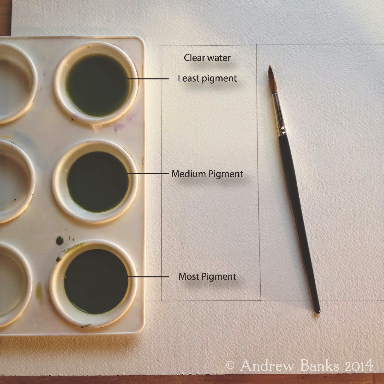
1)
Hold your sketchbook or paper at an angle to allow the watercolor to flow down the paper.  About a 35 degree angle works well for me.  If the angle is too high, the water will drip too fast for you to control.  If the angle is too low, the paint will not move fast enough, could cause unwanted buckling of the paper and will not allow for a smooth wash.

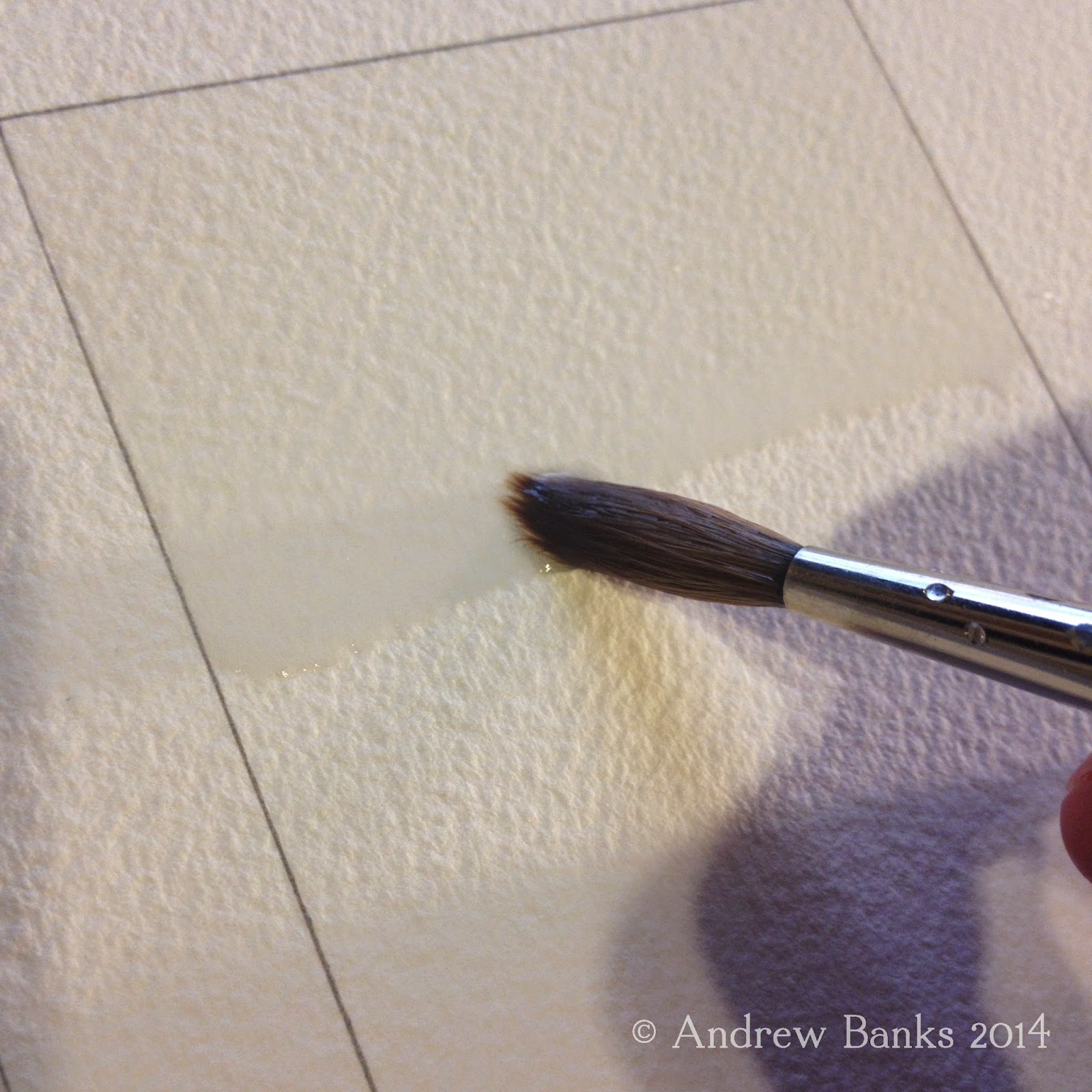
2) Load brush with completely clear water.  Apply clear wash to paper, creating a bead, allowing the water to gather slightly.  (If your angle is just right, the water will stay where you guide it.)  Make sure there is an even amount of water in all parts of the bead.


3)
  Load your brush with a highly diluted watercolor wash and introduce it into the clear wash before it has time to soak into the paper and dry.  With downward brush strokes, pull the bead of paint down the page.  You will begin to see the pigment from your brush get pulled into the clear wash.


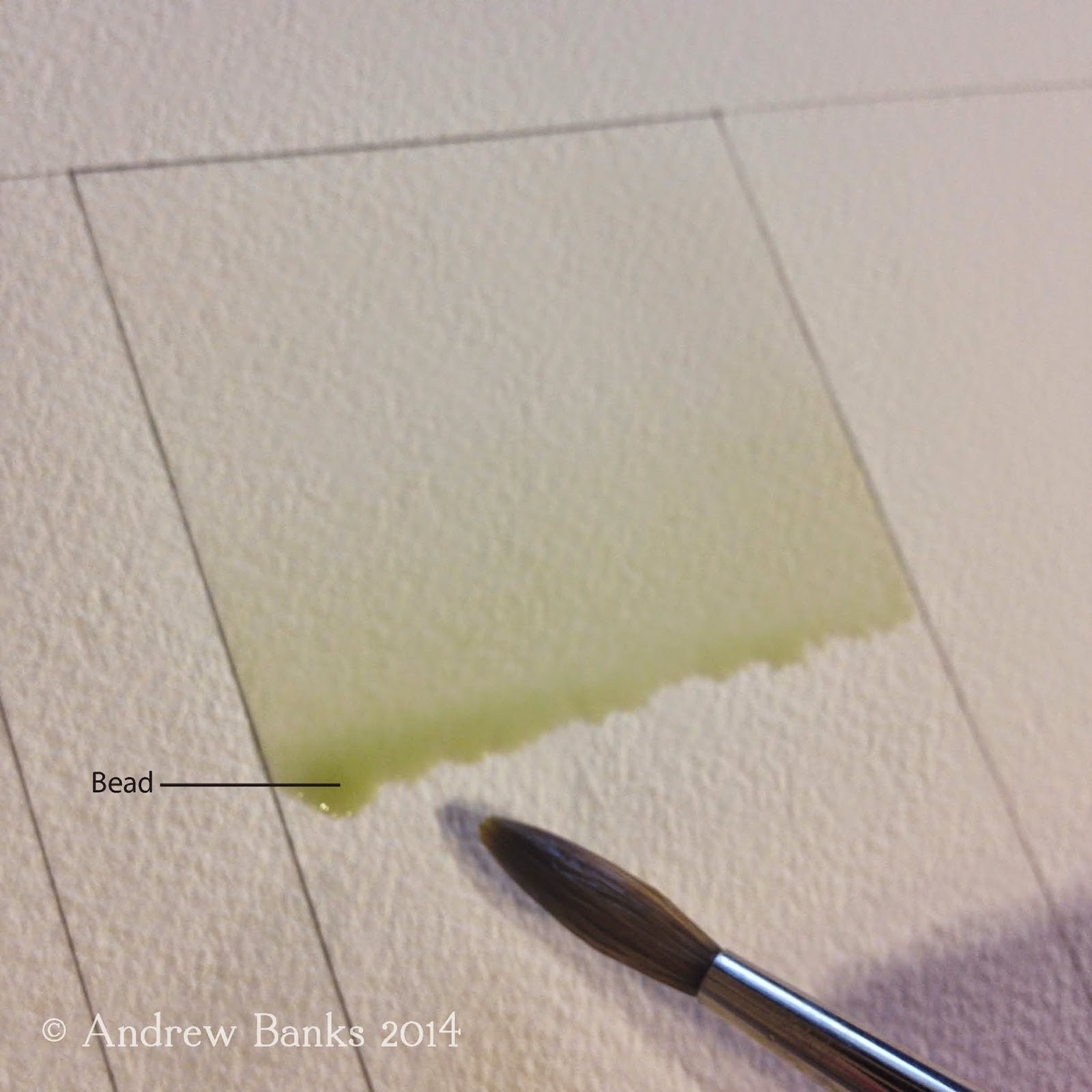
4)
Load your brush with a slightly more pigmented wash and introduce it into your bead, continuing to pull it down the page.  (Work on doing this quickly.  If you allow the bead to dry, you will be left with a line of color that will interrupt the graded wash).


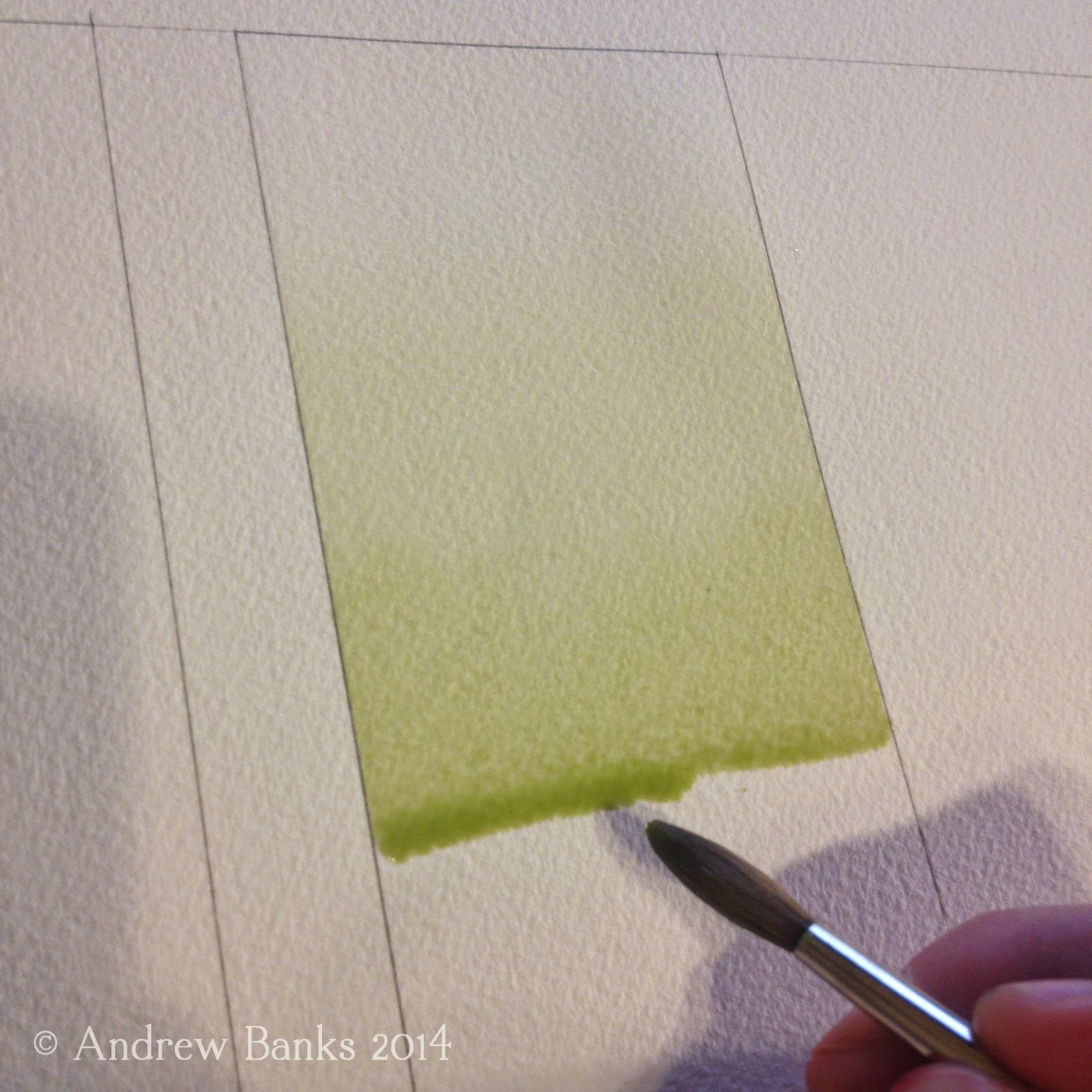
5)
Load your brush with the highest pigmented wash and continue to pull the bead downward.


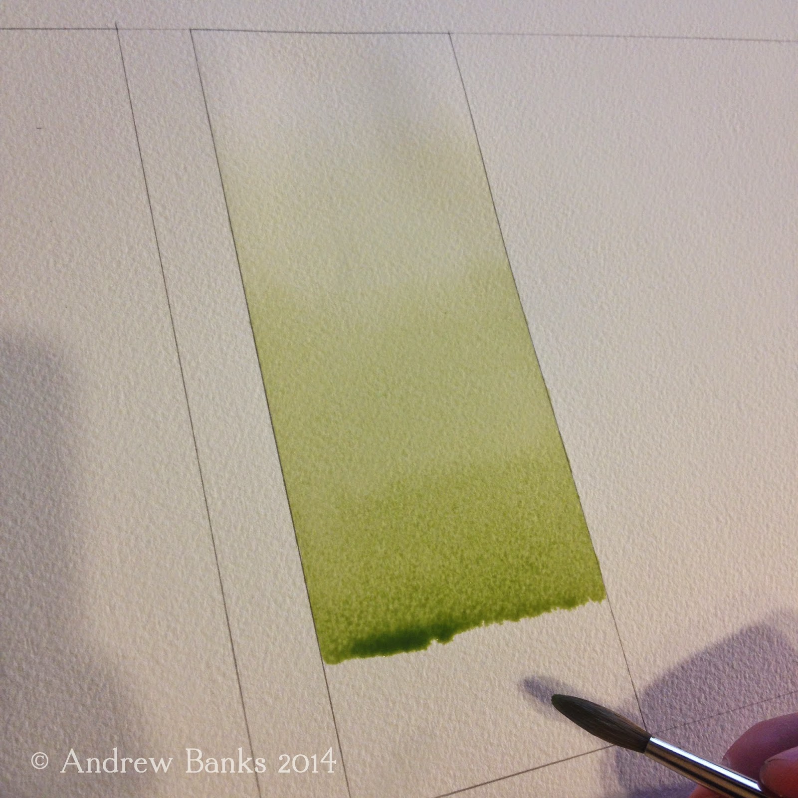
6) Bring your bead to your desired edge or location.  Shake the brush off of or touch the brush to a paper towel to absorb the excess water.  Gently touch your dry brush to the bead.  Your brush will absorb the excess water back into the brush, leaving an even surface of paint on the paper.  If we left the bead of water on the paper, the excess paint would diffuse back up into the earlier wash and would create an unwanted stain.


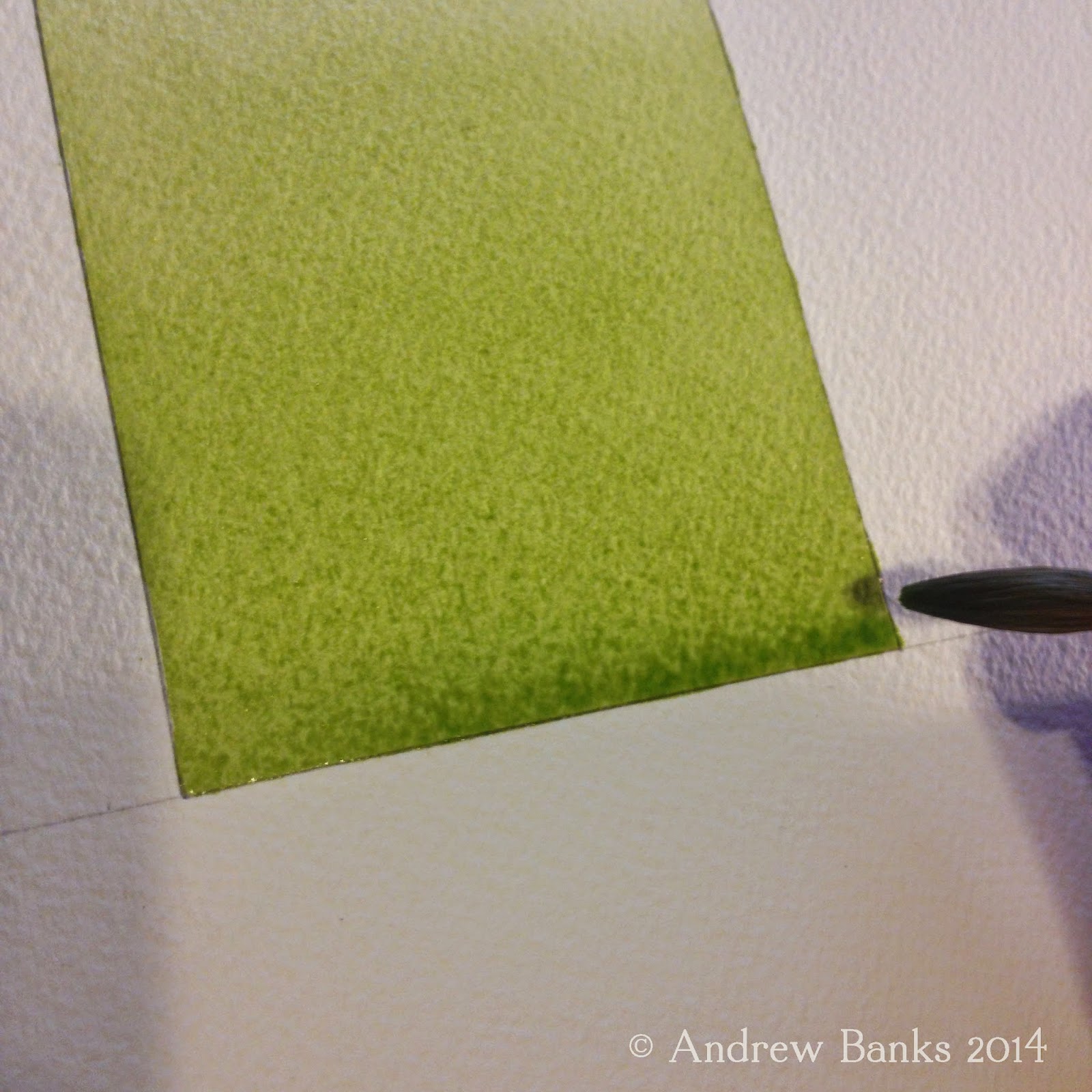
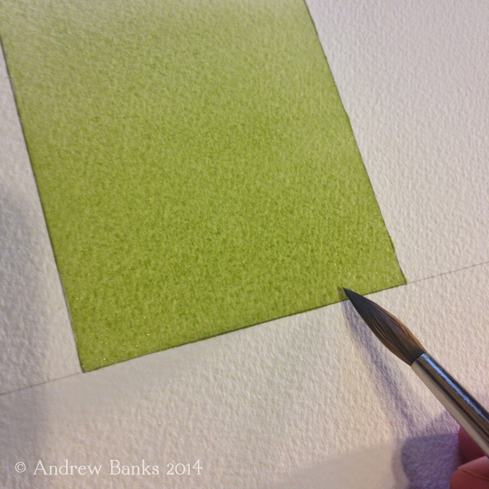
7) Repeat steps 2-6 until you get the values you want.

Graded Wash Applications:
Here are just a few examples of applications for graded washes
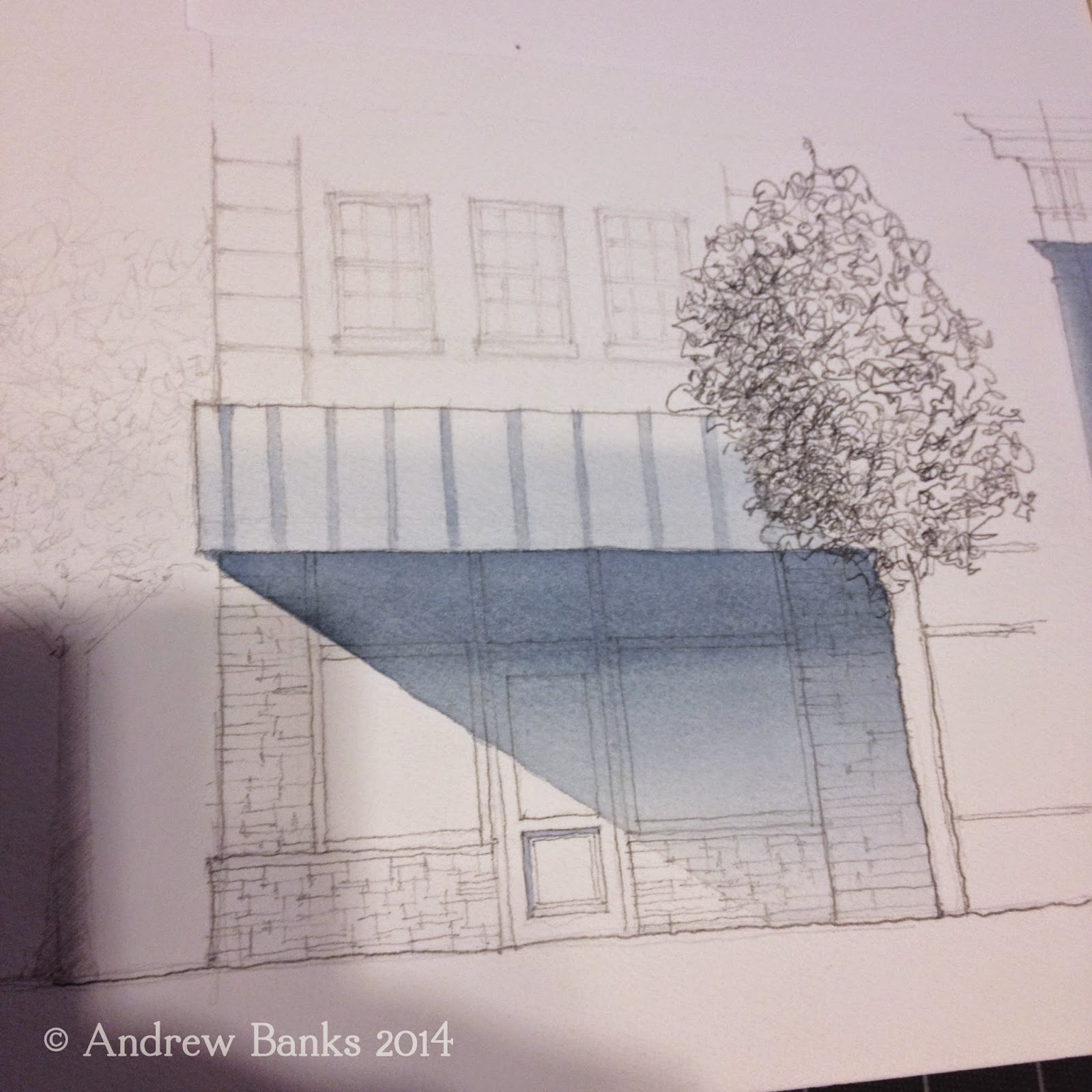
Shadows
Here, the graded wash works perfectly for a shadow cast on the underside of an awning.  On a sunny day, light will reflect off of the ground surface back on the building wall.  The graded wash allows you to show this reflected light gradually darkening as it gets farther from the ground and up under the awning.


Curved objects
Curved objects have a range of tones (highlight, mid tone, shadow, reflected light, cast shadow) that can be achieved with graded wash.

Skies
Depending on where the sun is in the sky, the sky will have a graded wash.  For example when the sun is low on the horizon, the graded wash will be light on the horizon line and darker the higher you go into the sky.  When the sun is higher in the sky it is generally the opposite.

Wednesday, October 22, 2014

More on Marker Techniques

Some of you may be curious as to how I apply the "Arched Fade" technique so I thought I would respond to that with a few examples. The top photo shows the same lifting action that I mentioned in my tutorial. Now take that same motion and follow the shape of your rounded object and it will help define the shape as well as indicate highlights.

A good thing to keep in mind is to always have your starting point furthest away from the light source and your lifting action should happen closest to where the light source is.

The Oscar Mayer Weinermobile, the iconic brand vehicle of the Oscar Mayer company, is a great exercise in lots of curved surfaces. Here you will see examples of the Push Fade, Pull Fade and Arched Fade techniques.

On any object that is curved, if possible, try to follow the contours of the surface to show the shape. On the shoes, I decided to use the "Flat Run" technique but instead of pulling straight lines, I curved them slightly to match the shape of the shoes.


Tuesday, October 21, 2014

Urban Sketching with Markers (Part I)

TUESDAY TIPS & TRICKS

Urban sketching is a crazy collection of whatever skills you can bring to the table. There are those who sketch with paints/watercolors, colored pencils, pen and ink, graphite, markers and even dry erase markers. It's all good. As they say in the south, "dance with the date you brought." I am one of a number of urban sketchers who has found comfort in the use of markers. Our styles range from a tighter, realistic style to a loose energetic style and everything in between. For example, check out the range of styles between Lisa Flahive http://flahive.fineartstudioonline.com/collections/48778, and Donald Owen Colley http://buttnekkiddoodles.com. Both have styles I greatly admire.

By the way, much like picking out paint brushes, there is a large variety of marker tip sizes and shapes available, from very fine pens, brush tips to chisel and calligraphy tips (also known as nibs in some places). The advantages of using markers is that they are fast-drying, blendable with other colors, and come in an assortment of colors and kits. For example, you can pick up a set of cool greys, warm greys, basic colors, earthy colors and pastel colors. These are great if you can identify in which color palette your sketches normally reside. Of course, you can always mix and match to create your own customized marker set. I will cover the many popular brands of markers available in my “Part II of Urban Sketching with Markers.”

Many people have asked me about my secrets to using markers. Here are a few tips that I like to use which may be of interest to you. (Click on the image below to enlarge it for better viewing and detail).


Step 1: I like to sketch out my scene in pencil or fine point pen.


Step 2: Using the Push Fade and Pull Fade techniques, I will add color. You can notice that, by lifting the marker during the stroke, you can achieve some nice graduation in color.


Step 3: Now I can go back over the original color strokes and overlap them with secondary strokes to add more color or more dimension. Often I will add pastel colors and pick up the sky tones, skin tones and reflections to add energy to the sketch.


Monday, October 20, 2014

Chicago Architecture Foundation Open House


Chicago Architecture Foundation Open House, 

Urban Sketchers Chicago, October 18, 2014

About once a year, the Chicago Architecture Foundation opens the doors to some of the most intriguing buildings and architecture to the public. While most of the public will walk the halls and admire the years of history behind the intricate details, stonework, sculptures and woodwork, Urban Sketchers Chicago takes advantage of this opportunity to grab our sketchbooks, watercolors, pens and pencils and capture as much of the details as we are able amongst the hoards of visitors, tourists, photographers and fans of architecture. While this can be a pretty overwhelming experience to sketch while the mouth is agape, our group did pretty well as evidenced in the collection of sketchbooks.


Tuesday, October 14, 2014

Composition is a big word

TUESDAY TIPS & TRICKS

Composition can be difficult to teach. Do this, don't do that… Unless you want to deliberately break the rules… And then it may or may not work… You stick to the rules - and it may end up boring. You break the rules - and it may end up unbalanced… What is a sketcher to do?

Composition is a skill, just like drawing or values or accurate color. This means that with practice a sketcher can develop a vision and understanding of the design as well as a feel for positioning of shapes within the boundaries of a drawing. By practicing composition it is possible to get and improve the sense and sensibility of what is composed well and as a result has a built-in beauty, and what needs improvement and what this improvement might be.

Composition is also a vast subject. This is another reason art students shy away from it.

Here I will suggest three things that can be practiced right away. They will work for on-location sketching without burying one's head in theory.

1. Balance positive and negative space

See that your actual objects of interest (positive space) and space around them (negative space) take more or less the same amount of space on your drawing.

Some examples:

- Crowded drawing - very little negative space


- Unfilled drawing - small subject surrounded by a lot of negative space


- Balanced drawing - subject and surrounding space take about the same amount of space


Remember a trick - an empty unfilled composition can be improved by creative cropping or borders.


2. Repetition and pattern

A human eye loves pattern. When we see and recognize repeating shapes it makes us feel clever and calms us. Repeats and patterns give an image rhythm and make it dynamic and lively.


3. Connection

Let your subjects and objects connect, touch and overlap. This is one and an obvious way to keep the composition together, like holding hands.

The other way to connect is by intent, using directional lines and visual tension.

Here's an example of a composition with overlapping objects:


In the following sketch three groups of people are connected by individual figures situated between the groups. These figures create the tension that holds the composition together:


So what to do now?

Now that you have these insights, it is time to practice them. When you chose your subject or view, take another minute and make a tiny plan. Here's an example of such plan: "I will include this bridge, and the river with its interesting colors and these trees on the right bank. I will leave out these buildings on the right shore, and a willow tree on the left… they will overcrowd my drawing." Better yet, make a thumbnail sketch and see how it looks.

Take the view you are sketching and make it into a design. Emphasize patterns if they are there. Look for geometrical patterns, color patterns, contrast patterns.

Check if your shapes connect/overlap or stand alone. If they are standing alone, is there a way create a connection or directional pull to tie the composition together? Even if there is not, you have taught yourself something about composition by having tried. 


Tuesday, October 7, 2014

Playing with Line

Nutmeg © Barbara Weeks


TUESDAY TIPS & TRICKS
A line drawing is like a solo piano. It can express everything from the even cadence of practicing scales, to the emotion of a concerto, to the novel rhythm of a jazz improvisation, and all with just a single instrument! A 2B pencil is usually my instrument of choice but a ballpoint, a fountain pen, a fiber-tipped pen or even a stick can bring its own distinct qualities to a sketch. 

There are many reasons to explore line as a drawing technique. Here's just a few:
  1. It comes naturally to us. Watch a child draw with abandon using line. We all unconsciously doodle with line. We should stretch and develop this natural tendency.
  2. Line emphasizes shape and helps us see structure. 
  3. It can be a quick way to get fleeting impressions of our surroundings down on paper.
  4. A single line can be slow and sensitive describing the attitude of a shoulder or the roll of a hilly landscape.
  5. Line can show the erratic movement of a crowd or the scratchy texture of a piece of toast.
  6. A confident and varied line can give even the most mundane subject character.
Starbucks © Barbara Weeks
Toast © Barbara Weeks


A few tricks:
  1. Vary the pressure on your line from heavy to light to disappearing to show volume and distance. 
  2. Restate a line when searching for a shape or form. Don’t erase the old line. It will add life and energy to the drawing.
  3. Practice making lines that describe different textures such as smooth, hard, soft, hairy.
  4. Practice freehand drawing straight (well, straightish) lines on the paper varying the  thickness. When I practice I usually make two dots at least three inches apart and then connect the dots. and work down the page. It will give you a sure hand and a confident line. It’s like practicing the scales on the piano.

Ouch! © Barbara Weeks
African Ape © Barbara Weeks
A beautiful painting is a wonder to behold but there is much to be said for the simple power of a line drawing. It’s like a full orchestra and a solo piano.