Pages

Tuesday, March 30, 2021

Hindsight Forward


Let’s Sketch!

Redo That View 

Sunday, April 4

12 PM - 3 PM CST

Hosted by

Among artists past and present, the practice of interpreting the same view or composition a number of times has been used to gain insight and facility with a subject. This week, let’s take a page from their book.


Details

  • Look through your previous sketches and find a scene that you’d like to do again. Make sure it is something accessible - we are sketching on location, not from the previous sketch
  • Create a new interpretation of the scene. 
  • Extra credit if you do the sketch with a different medium this time!

During our group throwdown on Sunday, April 4, post both the old and new sketches. Tell us a little bit about why you chose to redo that scene, and anything you noticed or learned by doing it a second time.


As usual, we will gather from noon to 3 p.m. to share and discuss, but of course late submissions are always welcome.


Banner sketch by Gail Dokucu of the same view,

May 2020 and March 2021.


Please include #uskchicago and #uskathome on your posts to Facebook and Instagram.


Want to keep up to date by email? Fill in your email address in the place provided in the upper right corner under the banner. We look forward to hearing from you.


Thursday, March 25, 2021

T&T Thursday!


People Who Need (Watercolor) People

By Barbara Weeks


Often in urban sketching we focus on the architecture or landmarks we encounter to tell the story of our surroundings. There are times when we add people to the scene, even when they’re not the focus. They give scale, energy, life, and an invitation into the scene.


When you need or want an extra spark in your landscape or cityscape including people can be the trick you need. In this post I’m going to give you tips for using watercolor to add figures to your work. 


Carrots and Rectangles

  • Think simple.
  • Think shape 
  • Think gesture

The Carrot -Simple as 1, 2, 3!

There are many approaches for quickly adding figures to watercolors. I use a combination of two different methods – carrots and rectangles


Both ways employ similar mind sets.


From just a few strokes, a simple basic figure.

    1. Start with simple carrot shape 

    2. Add a head

    3. Add a little gesture and shadow 


Repeat the process and add a little embellishment. 


Now try playing with just slight changes to the gesture and size of the carrot shapes. Add more, create a crowd or a parade!


The Rectangle

    1. Start with a rectangle

   2. Add two strokes for legs

   3. Add two strokes for arms

   4. And one for a head

                                           Tah Dah! A person!


Urban Sketching


One of my favorite ways to capture the personality of a place is through its people. As simple as these methods are you can add attitude and personality.


  • Try varying the size of the initial shape – wider, thinner, longer, shorter. 
  • Paint a group of carrots and rectangles together. Let a few overlap and let the paint mingle.

  • What happens when the head stroke touches the shoulder line?When it doesn’t?
  • Experiment, add line to emphasis or embellish some of the shapes.


As always, have fun!


T&T Thursday is a twice a month column about sketching skill-building ideas. Some of the columns will be brand new, others will be refreshed columns from the past. 


Want to keep up to date by email? Fill in your email address in the place provided in the upper right corner under the banner. We look forward to hearing from you.


Tuesday, March 23, 2021

Seeing Spring


 Let’s Sketch!

Signs of Spring 

Sunday, March 28

12 PM - 3 PM CST

Hosted by

Gail Dokucu, Urban Sketchers Chicago

and Guest Host, Kris Van Stockum


Our Chicago weather is breaking, signs of spring are popping up all over.


What says spring to you?


Details:

It could be:

  • brave crocuses pushing up in your yard or park
  • buds slowly opening on your favorite tree 
  • that mound of snow finally shrinking 

Or maybe:

  • a sign of spring is a favorite color. Use it in your sketch! 
  • a sloppy puddle left over from spring rain 
  • perhaps it’s the way the light of our longer days hits a building 

Show us your signs of spring – 

we could all use it.


As usual, we will gather for our virtual throwdown on our group Facebook page on Sunday, March 28, between noon and 3 pm, but late entries are always welcome.


Banner sketch by Kris Van Stockum


Please include #uskchicago and #uskathome on your posts to Facebook and InstagramRemember, we are back to following USk Global’s posting guidelines of sketching live on location and not from reference photos.


Want to keep up to date by email? Fill in your email address in the place provided in the upper right corner under the banner. We look forward to hearing from you.


Tuesday, March 16, 2021

Let There Be Light


 Let’s Sketch!

Let There Be Light

Sunday, March 21
12 PM - 3 PM CST

Hosted by

Gail Dokucu, Urban Sketchers Chicago

and Guest Host, Kari Ann


Details

Even though the Spring Equinox was yesterday and we might not need lamps as much as we used to, today’s theme has to do with light!


Sketch a scene:

  • with your favorite lamp or chandelier 
  • with some interesting light or shadows to capture the atmosphere!
  • revisiting the hygge theme with a candlelit display


Banner Sketch by Kari Ann


Please include #uskchicago and #uskathome on your posts to Facebook and InstagramRemember, we are back to following USk Global’s posting guidelines of sketching live on location and not from reference photos.


Want to keep up to date by email? Fill in your email address in the place provided in the upper right corner under the banner. We look forward to hearing from you.


Thursday, March 11, 2021

T&T Thursday!

Composition is a Big Word–PART TWO 

By Alex Zonis


What if you have become so interested in composition that you want to dig deeper? No problem!


Here are more composition insights – Rules!


1. Rule of Thirds


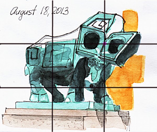
The Rule of Thirds is an easy compositional rule to remember. Splitting an image in half vertically or horizontally produces a sketch with a point of interest squarely in the middle. This can be just a little bit boring.


Instead divide a page in thirds both horizontally and vertically, and place the focus of the sketch in one of the spots where the lines intersect. As a result a viewer eye is drawn to the strongest point in one of the intersections, then around the sketch following the lines of the object.


At first it may be helpful to draw the lines to divide the drawing in thirds and use them as an aid to find “sweet spots” as they are sometimes called. After some practice the lines will become unnecessary and you will just see where the strongest impact spot is. If you do thumbnail sketches first, draw the grid of thirds on top to check the composition.


2. Rule of Odds


How many of anything is included in a composition makes a difference. An easy thing to remember is that odd is better than even, an odd number make a composition more dynamic.


When there is an odd number of objects in a drawing, it is harder to pair them up, which we do subconsciously, and this means that a viewer will be looking at the drawing longer and keep their eyes moving within the drawing.


Of course if we are sketching in a sidewalk cafe and drawing four people sitting at a table in front of us, skipping one or inventing one extra may not be the best solution. Instead we can be creative and check for interesting reflections, or a shadow, or a pigeon!


There are 6 bottles in this drawing - an even number, but 3 strong and interesting shadows bring the number of shapes to 9.


3. Full range of values


For a good composition we want to have a full gamut of values in the image: from lightest lights to mid tones to darkest darks. If we have this variety of values, the drawing is already pretty good. For a really strong composition the lights, mid tones and darks need to be included in different amounts. Here’s a simple way to remember it: “two thirds, one third, and a little bit.” For example, “two thirds of dark, one third of mid tone, and a little bit of white for flowers and highlights.”


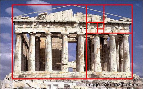
4. Golden Ratio


No discussion of composition is complete without talking about Golden Ratio or Golden Rule. This magical ratio is also known as Golden Section, Golden Mean, Golden Number, Divine Proportion, Golden Proportion, Fibonacci Number, and Phi. Leonardo da Vinci used Golden Ratio in his paintings a lot.


This is an extremely interesting and beautiful concept. I enjoy reading about it, but was unable to use it when sketching on location - it is a matter of time. So I cannot talk about from a practical standpoint. Instead I would like to refer you to this article on Empty Easel blog – Golden Section for Artists .


I hope you find these thoughts on composition useful and would love it if you will use them in your sketches!


T&T Thursday is a twice a month column about sketching skill-building ideas. Some of the columns will be brand new, others will be refreshed columns from the past. 

Want to keep up to date by email? Fill in your email address in the place provided in the upper right corner under the banner. We look forward to hearing from you.


Wednesday, March 10, 2021

It is the Best of Times, It is the...


Let’s Sketch!

Best of Covidtine
Sunday, March 14
12 PM - 3 PM CST

Hosted by 

 Evelyn Brody and Urban Sketchers Chicago


USk Chicago marked the last Ides of March with our first USk Chicago at Home virtual meet-up, and we haven’t missed a themed week since. (Many thanks, admins and guest hosts!) 


As the vaccine rollout brings the promise of a return to normalcy, let’s take the opportunity to reflect on what we’ve accomplished over this crazy year.


Details:

This Sunday, we would like everyone to post their favorite sketch(es?) from the last twelve months. Perhaps staring into your closet early on in the lockdown brought you peace. Perhaps you want to commemorate the summer struggles of a local business. Or did you find solace this fall or winter sketching with a few (masked and socially distanced) friends? Let’s share those masterpieces!


Of course, with this week’s glorious weather, it’s a pleasure to be sketching outside. As always, feel free to also post new work!


And don’t forget to set your clocks ahead this weekend. Yay, later sunsets!


The banner image is a crop of a collage of Evelyn Brody's 2020 Procreate sketches for USk Chicago virtual meetups.


Share your Urban Sketches with us from 12 noon to 3pm on Sunday. Please include #uskchicago and #uskathome on your posts to Facebook and Instagram.


Want to keep up to date by email? Fill in your email address in the place provided in the upper right corner under the banner. We look forward to hearing from you.


Thursday, March 4, 2021

... Can Spring Be Far Behind?


Let’s Sketch!

Thinking Green
Sunday, March 7

12 PM - 3 PM CST

Hosted by 

Paul Ingold and Urban Sketchers Chicago


Spring isn't here yet, but it's just around the corner, and I think we're all ready to start seeing some green. 


DETAILS:


For this week, "Green" will be our primary focus.

This can mean 
  • either your subject is green
  • or sketch in a green monochromatic look and feel. 

Any type of medium can be used (example: watercolor, water-soluble ink, color pencils, etc.) We can sketch views from our homes, out the window, or out and about.

There are no rules other than our Urban Sketching guidelines, be creative.A reminder that we are following USK Global's posting guidelines of sketching live on location and not from reference photos.

Share your Urban Sketches with us from 12 noon to 3pm on Sunday. Please include #uskchicago and #uskathome on your posts to Facebook and Instagram.

Looking forward to seeing your sketches! 

Cover sketch by Mary Jo Ernst. 


Want to keep up to date by email? Fill in your email address in the place provided in the upper right corner under the banner. We look forward to hearing from you.